Designing Websites for Reflexologists
This is the Griffen Mill design guide to designing websites for reflexologists, part of our website design guide series. Over the years, the individual designers within Griffen Mill have created websites for a huge number of reflexologists, via our key client WebHealer. As one of the therapies that are usually referred to as complementary, a reflexology website must, in our opinion, convey a professional and health oriented identity, yet avoid coming across as too clinical. The designer must also be mindful of the target audience, which is very often female, and this can affect preferred colour choices. In general, for reflexology websites, warm colours tend to work better than cooler ones.
Guide Structure
This guide, like most in this series, has the following key sections.
- Typical design requirements for reflexology websites
- Choosing colour for reflexology websites
- Shape and related aesthetic decisions
- Images and photographs for reflexology websites
- Special considerations for mobile reflexology
This guide continues with section one, and you may use the above links to read more about later sections, which will go into more detail. In each case, the approach used to communicate our ideas leans towards examples, such as examples of images useful for a reflexology website or palettes that often appeal to reflexologists.

Typical design requirements for reflexology websites
Although each reflexologist will have their individual preferences in terms of style, colour palette and imagery, certain common traits appear often in reflexology website design. Very often, unless the client is aiming to appeal more for corporate business, the colour palettes used will tend to warmer colours, such as plum and pink, which are softer, more personal and inviting. When done well this will help evoke a sense of wellbeing and comfort.
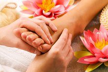
When choosing the colour palette, the designer should be mindful of the images used and the tones used within them, so often there will be skin tones. To help with a harmonious colour scheme, the photographs used can involve a composition that includes the range of colours in the palette e.g. feet shown amnongst purple flowers.
Finally, shapewise a reflexology website will tend to have more flow and organic curve than, say a counselling website. The designer should be mindful though that an image of professionalism is important as well as an image of just warmth and the human touch.
Example Reflexology Websites
Here are a couple of examples of reflexology websites, which are built on a generic design which we created:www.mirireflex.co.uk and www.reflexology4london.co.uk.
Here are some more examples of reflexology websites. Some have been created as bespoke designs by members of the Griffen Mill team, whilst others are built on a generic design which we created.
Jeremy Snell has selected a Bronze design for his reflexology website and he has gone on to add some personal customisation to the colour scheme. This has helped to incorporate colours from his portrait image and also the logo he uses on his Twitter feed into his website adding consistency to his brand. This design is one of WebHealer’s mobile friendly designs which is an important factor when the majority of internet use today is via a mobile or tablet. His pages are easy to read as he has added short well-spaced paragraphs of text and he has added a relevant image to each page to help to illustrate the content. These observations and comments were made on September 12th 2016 – the website may have been updated since then. www.jsnellreflexology.com
Leanne Liddle is using a simple Mobile optimised design for her Massage website based in New Zealand. She has customised her design with own logo and chosen a custom colour scheme which uses blues and soft mauves to convey a sense of relaxation. Purple or mauve is a popular choice for holistic therapies as it is a colour associated spirituality as well as with luxury. Her home page is then enlivened by the use of two photographs of sunflowers blooming in a field. Again this is very fitting as yellow is a cheerful colour associated with enegy and well-being and works well on a website which offers both Deep tissue massage therapy, and massage workshops. These observations were made on December 8th, 2015 – the website may have been updated since then. www.leanneliddletherapies.com
On 22 December 2011 Nicola Warran Holistic Therapies relaunched their website www.nwreflexology.co.uk after an A La Carte redesign by our designer Megan. The client was open to considering a variety of look and styling, but with a preference for curves and organic flow. See full press release
On 2 December 2011 Inspira relaunched their website www.inspira-reflexology.co.uk after an A La Carte redesign by our designer Megan. The client preferred a look with individuality, but with a preference for curves and organic flow. See full press release
On 11 February 2011 Total Foot Care relaunched their website www.total-foot-care.co.uk after an A La Carte redesign by our designer Amanda. The client preferred a look with individuality, but with a preference for curves and organic flow. See full press release
On 22 June 2010 Christy Wearne relaunched their website www.sole-revival.co.uk after an A La Carte redesign by our designer Amanda. The client was looking for a professional design, slightly understated, but with a leaning to a structured, neatly sectioned design. See full press release
On 8 June 2010 Soles to Soul relaunched their website www.solestosoul.co.uk after an A La Carte redesign by our designer Amanda. The client was looking for a professional design, slightly understated, but with a preference for curves and organic flow. See full press release
On 27 April 2010 Me-Time Therapies relaunched their website www.holistic-me-time.co.uk after an A La Carte redesign by our designer Amanda. The client preferred a look with individuality, but with a preference for curves and organic flow. See full press release