
Reflexology Website Design - Shape and Aesthetics
Back to Reflexology Website Design Guide.
This is the Griffen Mill Design Guide to designing websites for reflexologists. This section focusses on the use of shape and related aesthetic decisions. Other parts of the guide focus on choosing images, colour and making appropriate content and copywriting decisions. Click to return to the main guide.
Aesthetic choices for reflexologists
In our experience reflexologists have a preference for website designs that have a flow to them and organic looking smooth lines. This will often work better with images from nature. Occasionally a therapist will prefer a more angular look perhaps it if fits well with a logo or a particular image they like. This might be diagonals or even something more boxy which can be better suited to a more corporate image.
Below we have shown a few examples of designs we have created, with some commentary explaining the design rationale, which you may find useful in seeking inspiration for your own ideas.
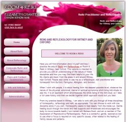
A more corporate look
The most striking thing about this website is that unlike most reflexology websites, this example has chosen a colour palette that is more clinical and businesslike rather than soft and warm. This professional image is reinforced by the logo which is clean and distinctive, but very simple. This has steered the designer to follow with an aesthetic that uses simple rounded square shapes, rather than something more flowing. Overall this website would suit a reflexologist looking to attract business customers, perhaps seeking to offer in house therapies for a corporate client.
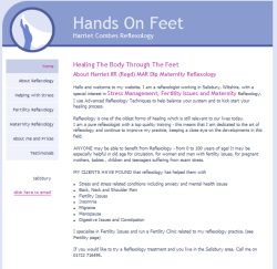
Personal and inviting
This next example has a more oganic flow to it, echoing the curvy shape of the client's logo. It has been kept simple though, so that the shape of the website design does not dominate and distract from the distinctive logo. To avoid being overly simplistic though, the curve between header and main body has a subtle fade to avoid a harsh line between the pale background and richer coloured heading.
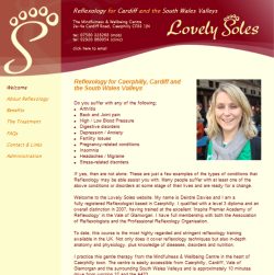
Individual and vibrant
This third reflexology website example uses a more vibrant colour palette and some rich flower imagery. A simple curve separates content from navigation. As the client does not have a distinctive logo, the heading area is busier as it does not risk distracting so much from a logo.
On 13 June 2011 Beverley Parmar relaunched their website www.reflexologyuxbridge.co.uk after an A La Carte redesign by our designer Megan. The client preferred a look with individuality, but with a preference for curves and organic flow. See full press release
On 15 June 2010 Enid O'Leary relaunched their website www.reflexologylimerick.com after an A La Carte redesign by our designer Amanda. The client was looking for a professional design, slightly understated, but with a preference for curves and organic flow. See full press release