
Reflexology Website Design - Using Colour
Back to Reflexology Website Design Guide.
This is the Griffen Mill Design Guide to designing websites for reflexologists. This section focusses on the use of colour. Other parts of the guide focus on choosing images, and making appropriate content and copywriting decisions. Click to return to the main guide.
Colour for Reflexologists
As with any website and client, individual client preferences are paramount, however in our experience certain colour choices and palettes are more popular with reflexologists. These tend to be colours associated with calm, warmth and softness, such as purple or lavendar. Rarely would we create a reflexology website cooler colours such blue and even green, which are better suited to a more "medical" website, although shades of green do fit well with complementary therapy sites, which involve reflexology. There is always a balance to be met when designing for reflexologists, as the website aims to be professional and grounded, yet it is also vital to create a warm and inviting appeal, sensitive to the nature of the client's work.
Another factor that will of course influence colour is the image choice, and reflexology websites are likely to include skin tones in images, particularly well tanned feet ! It is key therefore to ensure your palette complements this.
Colour Palettes for Reflexology
There are a number of tools online which are suitable for experimenting with and choosing colour palettes. Here are a few that we have used often for reflexology websites. Different therapists will have a leaning to different styles of palette, depending on whether they wish to present a more individual and vibrant look or something more low key and businesslike.
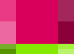
Option 1 : Warm and complementary
This palette is based around a warm magenta colour, which is in the range often used in reflexology websites, with green as a complementary colour. On the colour wheel, the warm colour has a hue of 338 degrees, although colours slightly cooler than are also fine. Starting from these basic colour choices, the palette shown gives the option of choosing more muted shades of pink and plum or richer more vibrant choices. The complementary greens can be used for links or subheadings, although bright greens such as lime green are best used in moderation (e.g. links) rather than for headings which could be shades of the main text colours.

Option 2 : Warm Monochramatic
A reflexologist who wishes to keep everything very low key, may find the complementary greens too garish, and so you could create the entire website palette from warm colours. You will of course needs some contrast for visibility, but brighter pinks might suit links, with darker purple for text and in between shades for headings.

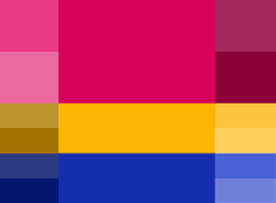
Option 3 : Warm Skin Tones
This is a palette based on an analogic colour palette, using a warm tone of 50 degrees hue as the reference colour. Analogic colour palettes are similar to monochromatic, but draw on other colours adjacent in the colour wheel. This may be very well suited to a reflexologist, as it allows for skin tones to fit alongside warmer tones. If the client wishes a warmer palette, then a hue of around 30-40 degrees would include even warmer purples and pinks.
Option 4 : Vibrant
Here is a much more vibrant colour palette, that at first glance may seem too bold for any therapist, never mind a reflexologist. The reference hue is however a warm 338 degrees, and the analogic system used is drawing colours from further round the colour wheel than the previous example, going into warmer orange & skin tones as well as cooler blue tones. It would not be wise to create a website for a reflexologist incorporating every colour in the palette, however careful selection of primary and accent colours could produce something striking yet stylish.
Example Reflexology Websites
Here are some examples of reflexology websites. Some have been created as bespoke designs by members of the Griffen Mill team, whilst others are built on a generic design which we created.
Barbara Hall is a Holistic therapist in Devon. For her reflexology website she has chosen to use on of our standard designs, the sea shore design. This design is limited in the way it can be customised, but it is a popular choice, and Barbara has chosen to highlight some of her text in the main content to complement the colour scheme of the design. You can see her website here www.barbarahallholistictherapist.co.uk
Blissful Harmony chose to use the services of one of the Griffin Mill designers for their bespoke Yoga and Reflexology website. They have picked out the harmonious yellows and oranges from their logo and incorporated these into the main area of the website which has been finished off with some complimentary images for the banner. You can see their website here www.blissfulharmony.co.uk
The website design that Christine Richards’ chose for her therapy website is an A La Carte design which was created for her by a Griffen Mill designer. This service has been discontinued and the mobile friendly Silver design service has taken its place. Even though this design is not mobile optimised, it is a very attractive website with a lovely fresh, clean and tranquil feel to it. The colours are soft and muted and are perfect for the range of reflexology and massage therapies that Christine offers. The combination of blue and green is ideal as they are said to convey a sense of trust and also of balance and growth. These observations and comments were made on March 15th 2016 – the website may have been updated since then. www.crtherapies.co.uk
The website of Dynamic Health is one of WebHealer’s latest mobile friendly designs so will automatically adjust according to the size of screen that is being used to view it. The pale green base of the colour scheme helps to convey a sense of harmony and development and the feature image of feet against a background of sky fits perfectly with this, giving a lovely calm and relaxed feeling to the site. Each page has then had an additional image added which symbolises the context of the text on the page. These observations and comments were made on December 2nd, 2015 - the website may have been updated since then. www.dynamicreflexology.co.uk
The design for the Holistic Feet Reflexology website is one of our Standard Designs, the CurvyColourMAX Design. Lesley Cooke has decided to use our suggested colour scheme and logo, even though the design does have a variety of options for customisation. You can see her website at www.holistic-feet.co.uk
The design for the website for Lovely Soles Reflexology in Cardiff and South Wales, has been created by one of our Griffin Mill designers. The warm graded red colour scheme adds a real feeling of warmth to the site and the complementary cream ties their logo into the design beautifully. If you would like to see their website, you can see it here www.lovelysoles.co.uk
This reflexology therapist and mindfulness coach has used a very harmonious colour palette for their therapy website. There is a mixture of blues, pinks and greys however the tonal range has been carefully selected by the practitioner to create a very harmonious effect. The same colours if done more vibrantly would clash, especially for a reflexology and complementary therapy website, but these colours work very well. www.mindbodyandsoletherapies.co.uk
Marie Rains Hypnotherapy and Reflexology website uses a palette of dark purples and mauves, which is relieved by clever use of lighter pinks and greys in her images. Colour can have a powerful affect on our attitudes and emotions, in fact our response to the visual stimulus of colour influences the release of hormones and hence our mood and behaviour so it is very important to get this right, if you want people to respond to your website in a positive way. Dark purple for example is a serious colour that is very suitable for a hypnotherapy website where trust in the therapist is essential. Mauve and pink on the other hand are popular colours for holistic therapies as they are associated with sensitivity, well-being and a feeling of luxury. Combining these colours together therefore is very effective. These observations were made on May 26th, 2016 – the website may have been updated since then. www.naturalbalance.org.uk
Beverley Parmar is a reflexologist in Uxbridge who has an A La Carte mini bespoke design created by one of the Griffin Mill team. They have chosen a strong colourful image and have used the main colour as a precedent for the scheme throughout the site. You can see Beverley’s website at www.reflexologyuxbridge.co.uk
Amanda Jayne offers Reflexology in the Stratford upon Avon, Leamington and Warwick area, and for her website she has chosen to use our Standard ColourMAX design, which she has customised to add her own personal touch to it. She has set her background colour to a specific #RGB colour code which matches the image she has chosen for her logo perfectly, giving her whole site a warm feel. You can see her website at www.reflexologywarwickshire.co.uk
Jeanette Barsalini offers Reflexology near Redhill and Reigate, and was looking for a personal website with a calming feel using lilac’s and blues. The Griffin Mill designer took this on board and found an image of a beach and chose a style of design that uses gentle curves to incorporate the whole coastal feel throughout the website. You can see their website here www.relaxingfeet.co.uk