
Counselling Website Design - Shape and Aesthetics
Back to Counselling Website Design Guide.
This is the Griffen Mill Design Guide to designing websites for counsellors. This section focusses on the use of shape and related aesthetic decisions. Other parts of the guide focus on choosing images, colour and making appropriate content and copywriting decisions. Click to return to the main guide.
Aesthetic choices for counsellors
In our experience counsellors have a preference for website designs that have a geometric, solid style or only subtle organic elements. Often a counsellor will prefer a more angular look that complements a practice logo or a particular image they like. This might be diagonals or even something more boxy which can be better suited to a more corporate image. Counsellors may wish to offset a very clinical and hard edged design with a softer landscape or natural image that suits the colour scheme.
Below we have shown a few examples of designs we have created, with some commentary explaining the design rationale, which you may find useful in seeking inspiration for your own ideas.
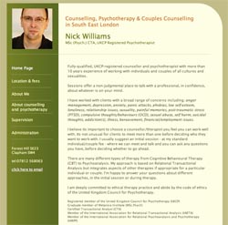
A more corporate look
This design incorporates a professional, corporate look that emphasises the medical approach to the counsellors work. This soft and elegant design incorporates an image of the counsellor, which we find an important feature to any counsellors website. The image provides a welcoming appeal by putting a face to a name, which may help to bring more enquiries to our clients.
Personal and inviting
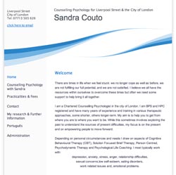
Whilst maintaining a professional and grounded appeal is important, it is also vital to remember the nature of a counsellors work. That is to connect and be considerate to their client's needs. Having a softer and warmer design may suit an individual who has a lone practice and would like to create an inviting and more personal appeal.
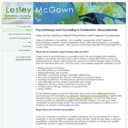
Clean and informative
This design shows a clear and concise website design suited for counsellors. The design is built around the counsellors simple and sophisticated logo, creating a clear and professional outlook. Whilst the overall shape of this website is very linear, the dynamic shape below the header softens the design and injects a splash of colour into this sophisticated design.
Debbie Orfila's Celestial Counselling website uses an uncluttered design in shades of blue with lots of white space around her content. This is very calming and encourages the reader to take their time browsing through the content and reading the informaton provided. Images of still water invite contemplation, water droplets and rippled water suggest change and images of stepping stones create splashes of interest and draw the eye into the page. These images almost provide a narrative of their own, creating a path across the pages, much as the stepping stones cross the water. These observations were made on 17th May, 2016 – the website may have been updated since then. www.celestialcounselling.co.uk
Chris Molyneux's Counselling and Supervision website uses a boxy, solid design in blue and white. These colours are often used to convey trust and dependability, and the clean, no nonsense layout of this website also reinforces this subliminal message. The linear structure of the website is easy to navigate, and the content is professionally presented, with bolded sub-headings and a good amount of white space between sections. This technique is called 'chunking' as it helps to break the page content up into 'bitesize' chunks. These draw the eye in and make it easier to scan the page for key information; it also makes it easier to 'digest' the information provided. These observations were made on June 27th, 2016 – the website may have been updated since then. www.chrismolyneux.co.uk
Carol Baker and Judith Hurwood's Counselling and Psychotherapy website plays with the senses by using playful, off-centered shapes within a compact and neat box. The effect is one that is simulataneously 'down to earth' and dependable, whilst also being uplifting and engaging. This duality is also seen in the feature image which contrasts the earthy tones of a woodland track and solid tree trunks with the soft, exuberant greens of sunlit foliage. There is also a pleasing contrast between the rigid straight lines of the trees and the curve of the woodland track which reiterates the vertical lines and the curvacious corners of the background design. These observations were made on June 27th, 2016 – the website may have been updated since then. www.counsellingleicester.co.uk
Linda Tinsley has chosen a natural theme with a soft colour scheme for her mobile friendly counselling website. The feature image of stepping stones gently meandering through a wood harmonizes flawlessly with the gentle curves of the design which seem to float out of the main page to the background giving a consistent and reassuring feel to the site. Natural themes are great for counselling websites as they help to convey a sense of down to earth stability which is ideal for those seeking help. These observations and comments were made on November 12th 2015 – the website may have been updated since then. www.lindatinsleycounselling.co.uk
The Mansion House Counselling Practice have selected one of WebHealer's mobile friendly designs for their website. The tranquil soft pastel colours help to convey a sense of calm while the gentle curves help to emphasise the peaceful atmosphere of the site. The feature image perfectly matches the swirls in the design as the stone path winds into the distance, encouraging a sense of discovery and optimism which is ideal for a counselling site. These observations and comments were made on November 13th 2015 – the website may have been updated since then. www.mansionhousecounselling.co.uk
The counselling website for Martin Kelly is using a mobile friendly design with a consistent and natural theme. The green colour scheme and feature image of a tree are well matched and give off a sense of balance and growth. The website has rectangular base to the design and this is said to convey a feeling of familiarity and stability and also of security and of things being in order. Whether we consciously pick up on this or not, these are reassuring elements for the layout of a website for a counsellor. These observations and comments were made on February 24th 2016 and the website may have been updated since then. www.MartinKellyCounselling.co.uk
Natasha Hughes has chosen WebHealer's standard Curvy ColourMAX design for her counselling website, with a restful blue/purple colour scheme to promote her Liverpool practice. In addition to the blue water droplet feature image, she's displayed a selection of her own images, including her portrait, which all appear top right in her content area on her website pages. This layout, together with way she uses space to separate paragraphs of text, gives a consistent shape to her website, though it might benefit from some more bold sub-headings to highlight different subjects in her wording. These observations were made on July 27th, 2016 – the website may have been updated since then. www.natashahughescounselling.co.uk
Sue Vaiey-Moore's counselling website uses a pleasing curved design in crisp blues and whites. These give a professional look to the website, whilst providing a soothing and calming environment in which to read the information provided. The website navigation is linear and easy to navigate with links being shown clearly down the left hand side. The content is also linear and therefore easy to scan and digest. This is important on a counselling website where the reader may be in an emotional state and need to find the information they are looking for quickly and easily, as well as feel reassured by the content of the website pages. These observations were made on July 7th, 2016 – the website may have been updated since then. www.suemoorecounselling.co.uk
Cemaliye Deran is using one of WebHealer’s Bronze designs, the Social ColourMAX design which is one of their latest mobile responsive options. She has chosen a slightly unusual feature image for her website which is one of WebHealer’s provided images and shows a selection of stones. The rounded smooth shape of the stones stands out, as the design as a whole has a lot of straight lines and edges while the variety of sizes and curves could be said to represent a softness amongst the strength and harshness of the stones themselves which some people may find themselves relating to. The other images that Cemaliye has added complement the colour scheme that been applied and this helps to give a consistent and elegant look to the website. These observations and comments were made on July 21st 2016 – the website may have been updated since then. www.zardentherapypractice.com
On 20 May 2013 The CBT Practice relaunched their website www.thecbtpractice.co.uk after an A La Carte redesign by our designer Megan. The client preferred a look with individuality, but with a preference for curves and organic flow. See full press release
On 3 March 2013 Counselling Plus relaunched their website www.pbcounsellingplus.co.uk after an A La Carte redesign by our designer Megan. The client was looking for a professional design, slightly understated, but with a preference for curves and organic flow. See full press release
On 25 February 2013 Judi Keshet-Orr relaunched their website www.jkopsychotherapy.co.uk after an A La Carte redesign by our designer Megan. The client was looking for a professional design, slightly understated and was prepared to let our designer suggest options. See full press release
On 20 September 2012 Margaret Lambert relaunched their website www.counsellingbeckenham.co.uk after an A La Carte redesign by our designer Megan. The client was looking for a professional design, slightly understated and was prepared to let our designer suggest options. See full press release
On 6 September 2012 Andy Gibb relaunched their website www.andygibbpsychotherapy.co.uk after an A La Carte redesign by our designer Megan. The client was looking for a professional design, slightly understated and was prepared to let our designer suggest options. See full press release
On 24 July 2011 Tina Welch Counselling relaunched their website www.tinawelch.co.uk after an A La Carte redesign by our designer Megan. The client was looking for a professional design, slightly understated and was prepared to let our designer suggest options. See full press release
On 17 June 2011 Hans Meijer relaunched their website www.hmcounselling.com after an A La Carte redesign by our designer Megan. The client was looking for a professional design, slightly understated, but with a preference for curves and organic flow. See full press release
On 19 May 2011 3 Counties Counselling Service relaunched their website www.3ccs.org after an A La Carte redesign by our designer Amanda. The client preferred a look with individuality, but with a preference for curves and organic flow. See full press release
On 10 May 2011 Lisa Reed relaunched their website www.lisacounselling.co.uk after an A La Carte redesign by our designer Amanda. The client was looking for a professional design, slightly understated and was prepared to let our designer suggest options. See full press release
On 28 April 2010 Carla Thompson relaunched their website www.ctcounselling.co.uk after an A La Carte redesign by our designer Amanda. The client was looking for a professional design, slightly understated and was prepared to let our designer suggest options. See full press release
On 26 March 2010 Zion Counselling relaunched their website www.zioncounselling.com after an A La Carte redesign by our designer Phil. The client was looking for a professional design, slightly understated, but with a preference for curves and organic flow. See full press release