Counselling Website Design - Branding
Back to Counselling Website Design Guide.
This is the Griffen Mill Design Guide to designing websites for counsellors. This section focusses on the use of branding, in other words the use of distinctive marks or logos, fonts and colour to reinforce the recognition and identity of a therapist's website business. There is some overlap with other section of this counselling guide which discuss colour, shape and overall aesthetics. Click to return to the main guide.
Branding for Counsellors
All promotional and marketing activities need to be carried out with sensitivity to the target audience and nowhere is this more the case than counselling and psychotherapy. Aggressive promotional activity, discounting and special offers is unlikely to be an effective strategy for a counselling practice, and can very quickly undermine the integrity, clinical authority and professionalism of the counsellors themselves. That is not to say however that there is no scope for branding and consideration of a practice's identity. Counsellors are very much individuals and some consideration of the style and personality of a counselling practice leading to a clear and consistent communication of that identity will be beneficial for all concerned. This may lead to the use of logos and consistent colour schemes, all of which can aid communication in its widest sense.
Do you need a logo?
A logo is far from essential for a counsellor, and a snazzy logo will never compensate for a poorly designed website or a website which does not communicate effectively. First and foremost comes communication, and if you are clear what you wish to convey about your practice, your style, your personality and your methods then a simple logo may very well complement that by adding a touch of professionalism which in itself provides reassurance and stability. Here are some examples of logos and branding marks used by counsellors who Griffen Mill Pixel Factory have worked with.
Professional and Minimalist
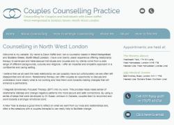
This client, Couples Counselling Practice use a very minimalist logo comprising two overlapping or linked oval figures. The logo is effective as the idea of linking reinforces the focus of this practice as specialising in couples and relationship therapy. The simple logo is also used in various places of the website as a distinctive mark. The simplicity of the branding extends to colour too, as the website is predominantly blue, a cool and calm colour associated with professionalism and a businesslike approach, which would appeal to couples who are experiencing difficult times.
Use colour only
This client took a different approach to branding. Rather than use a distinctive mark, identity was achieved through the use of colour only. The heading area of the design comprises three block colours, brown, slate blue and a deeper shade of blue. As before blue is used extensively through the website as a safe calming colour, with the more autumnal shade adding some warmth and a little lift in places as an accent colour. Structure and integrity are also reinforced using blocky design elements with clear boundaries, which again have positive connotations for a therapist.
The website of Sophie Amoni for her counselling therapy business was created for her by one of WebHealer’s Gold designers. Her logo has been incorporated into the heading area sitting opposite the text giving this a balanced feel. Butterflies can symbolise growth and development which is ideal for providing visual impact for a therapist so it a perfect choice for her business branding. The colour scheme of the website gives a professional, consistent and simple feel making it pleasing to the eye so the reader can concentrate on the message in the text of the website without being distracted by contrasting colours or images. These observations and comments were made on November 25th 2016 - the website may have been updated since then. www.amonitherapy.com
This Guildford based counsellor is building a brand and identity around an oriental or Zen theme. She has chosen smooth pebbles and delicate orange flower imagery which support this theme and fit well with a counselling website focus. www.angelaruarkcounselling.co.uk
Vicky Mould of Azalea Counselling has chosen one of WebHealer’s latest designs – the Social ColourMAX design. It is a mobile responsive design and can be customised by the client. Vicky has done this adding her own logo which is a lovely simple illustration of an azalea flower and she has also added a personal touch to her colour scheme. She has picked up the main colour her logo image and added this as an accent colour to emphasise certain areas of the design, while the other areas have a neutral grey giving a very profession feel to the site. These observations and comments were made on July 29th 2016 – the website may have been updated since then. www.azaleacounselling.net
Bea is a counsellor and therapist working in Haringey, North London. She has chosen a design with earthy tones for her website with a feature image depicting a path leading into a wood – a metaphor which is very appropriate for a counselling website, as therapy is a journey of self discovery. Bea has enhanced her website further by including a flower-based motif in a warm brown colour with each new paragraph. This is an interesting shape and has the potential to be a distinctive branding feature for her therapy practice website and other visual communications. It also adds interest and helps to break up her pages so that the reader is not faced with large blocks of text. The recurrent motif also helps to draw the reader's eye into the page, but doesn't distract from the information that Bea has provided. Observations made on December 10th, 2015 – the website may have been updated since then. www.bea4therapy.com
Delia Taylor-Brook has chosen the standard WebHealer design Social ColourMAX for her psychotherapy and counselling website, to promote her practice based in Witney. She has customised the design to suit her own branding by using her own feature graphical image of a butterfly with "follow your heart" and other wording included in the graphic. The butterfly's purple colours are nicely echoed in the website colours she has chosen to set, being various shades of purple to match the butterfly's wings. The overall effect is one of a consistent brand for her business. These observations and comments were made on July 29th 2016 and the website may have been updated since then. www.counsellingwitney.co.uk
David Pinner has used the services of one of Griffen Mill’s Gold designers for the design of his Counselling and Psychotherapy website. It is a lovely fresh and clean site, with a clear theme that runs throughout it. His logo is placed in the top corner and the colour from this has been added as an accent colour to other areas on his pages. His logo has also been used as a feature image at the top of each page, which fades into another image before a key message for the page gently sits on top. He has also added an image of himself to the Home Page which is a great way of increasing a sense of familiarity with the potential client and has been proven to encourage contact. These observations and comments were made on July 29th 2016 – the website may have been updated since then. www.davidpiner.com
Branding can be an expensive business and is often out of reach for many therapists. This counsellor and psychotherapist has however adopted a simple but effective signposting metaphor to use as a branding logo for her therapy practice. It has been combined with a subtle low key colour scheme to create a simple but effective online presence. www.dlc-psychotherapy.com
Frances Ross has used a bold design called 'Chequers' for her counselling website and included a custom logo in both the sidebar and at the foot of each page to give the website a strong identity which fits well with psychotherapy. She uses subtle, earthy browns for her background colours which work well with the 'tribal' feel of her logo image and she complements this with green text for her main title and emphasised text and with 'natural' imagery, taken from nature. The website flows well and is very easy to read as good use is made of formatting throughout her pages. She has used both bold and underline features to highlight her headings and break her pages into easy to digest sections. These observations were made on 5th May, 2016 – the website may have been updated since then. www.francesrosscounselling.com
This counsellor has decided on an impressionistic style to support her online identity. This can be an effective approach for a counselling website as it establishes an engaging thoughtful tone. www.helenbazzard.co.uk
Liz Jaymal is still using an A La Carte design for her counselling website which has been replaced by the Silver Design service which has mobile friendly function. This is though, still a great looking design. The feature image at the top of the page is a lovely warm image with soft colours which has a calming effect and which is very suitable for the website of a counsellor. The colours in the image have been picked out and have been used throughout the site which gives a consistent and well balanced feel to the site. Liz has then added further images to the site to further enhance and illustrate her message. Care should be taken though and further imagery fits in with the general colour scheme and a similar theme is maintained. These observations and comments were made on September 16th 2016 – the website may have been updated since then. www.lizjaymalcounselling.co.uk
Maria Lonergan is using one of WebHealer's social media compatible designs so that she can incorporate her Twitter feeds into the website. She has also worked with a designer to include her business logo of a stylised tree in brown and leaf green tones. She has then echoed this sylvian theme in her feature image of a path meandering through a bright sunlit wood, and in her portrait photograph where she is seen wearing a green top, against a leafy backdrop. The overall effect is harmonious and also uplifting. The path leading into the sunlight is also a very effective metaphor for a counselling website. Observations made on December 10th, 2015 – the website may have been updated since then. www.ml-counselling.co.uk
It is not that common for private practice counsellors to invest in formal branding and logos, however it is good practice to present a consistent theme and identity through a counselling website. This therapist has used her coastal location as an identity for her practice and reinforced this with a striking image combining sand, the seashore and a zen influence. www.nataliahallamcounselling.com
Honora Totman has opted for a Griffen Mill Gold bespoke design for her counselling website and has created a strong yet tranquil styling brand for it. Parts of her logo have been incorporated within the rotating feature images of her pages and she has carried the colours from the logo into the visual language of the website. This has helped to create a sense of consistency and balance that is naturally pleasing to the eye of the viewer (or potential client). These observations and comments were made on December 3rd, 2015 - the website may have been updated since then. www.northcotswoldstherapy.co.uk
The mobile friendly design for the Poplar Counselling website has a strong natural theme. Their business name, feature image and logo are all ‘tree’ based evoking strength and growth and giving a degree of consistency to their website branding. At this stage the client has chosen to place the logo within their content area, although many clients with distinctive branding upgrade to create a unique design identity built around their logo using either our Gold or budget Silver design service. These observations and comments were made on November 12th 2015 – the website may have been updated since then. www.poplarcounselling.co.uk