Alexander Technique Website Design - Shape and Aesthetics
Back to Alexander Technique Website Design Guide.
This is the Griffen Mill Design Guide to designing websites for Alexander Technique practitioners. This section focusses on the use of shape and related aesthetic decisions. Other parts of the guide focus on choosing images, colour and making appropriate content and copywriting decisions. Click to return to the main guide.
Aesthetic choices for Alexander Technique practitioners
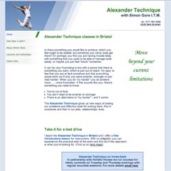
In our experience Alexander Technique practitioners have a preference for website designs that have a geometric, solid style or only subtle organic elements. Often a practitioner will prefer a more angular look that complements a practice logo or a particular image they like. Yet these straight edges are often offset by use of a simple curved element or emphasis upon images of people that suit the colour scheme.
Below we have shown a few examples of designs we have created, with some commentary explaining the design rationale, which you may find useful in seeking inspiration for your own ideas.
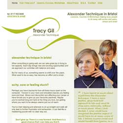
Calm and personal
This design creates a calm and inviting appeal by way of a delicate balance of complementing elements. The dynamic logo design works well alongside a gentle background tone and subtle geometric elements within the layout design. The colour scheme is based around natural green tones, often used within Alexander Technique websites.
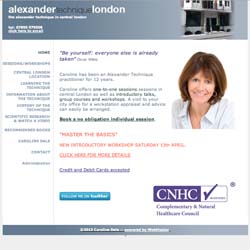
Clear & professional
This design has a clean and clear set up along with a simple monochromatic colour scheme that complements the header bar. A professional white background tone along with a geometric layout design sets out an informative design that highlights the medical approach to a practitioners work. With an image of the practitioner upon the home page, the design is softened with an inviting appeal.