
Osteopathy Website Design - Shape and Aesthetics
Back to Osteopathy Website Design Guide.
This is the Griffen Mill Design Guide to designing websites for osteopaths. This section focusses on the use of shape and related aesthetic decisions. Other parts of the guide focus on choosing images, colour and making appropriate content and copywriting decisions. Click to return to the main guide.
Aesthetic choices for osteopaths
In our experience osteopaths have a preference for website designs that have a geometric, solid style or only subtle organic elements. Often an osteopath will prefer a more angular look that complements a practice logo or a particular image they like. This might be diagonals or even something more boxy which can be better suited to a more corporate image. Osteopaths may wish to offset a very clinical and hard edged design with a softer image, involving people or nature, that suits the colour scheme.
Below we have shown a few examples of designs we have created, with some commentary explaining the design rationale, which you may find useful in seeking inspiration for your own ideas.
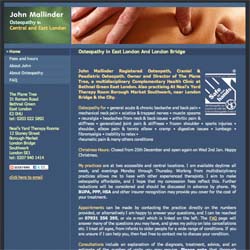
Smart & Professional
This design has a more business like feel to it, yet still incorporates a sense of energy along with a warm and inviting appeal, typical to that of osteopathy websites. The use of straight lines and geometrical features to the websites elements complements the curvy nature of the hands in the image. Using brighter skin tones within the highlighted text and links helps to make the important information stand out and break down the page well, whilst also relating back to the header image. This professional and grounded approach appeals to both individual clients and businesses alike.
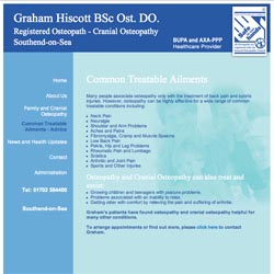
Clear & Grounded
This design has a clean and clear set up along with a simple monochromatic colour scheme that complements the Osteopathic Certification Mark used within the header. A lighter background tone along with a geometric layout design sets out an informative design that highlights the medical approach to an osteopaths work, whilst a watermark image of happy people in the background emphasises the human element of an osteopaths work.
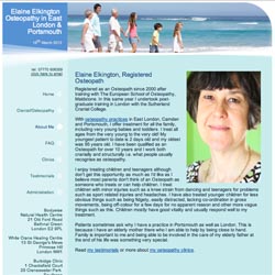
Personal & Inviting
Whilst maintaining a professional and grounded appeal is important, it is also vital to remember the nature of an osteopaths work and the hands-on aspect of their treatments. Having a softer and warmer design may suit an individual who has a lone practice and would like to create an inviting and more personal appeal. A header image that includes positive and active people of different age ranges can create a universal feel too.