
Designing Websites for Osteopaths
This is the Griffen Mill design guide to designing websites for osteopaths, part of our website design guide series. Over the years, the individual designers within Griffen Mill have created websites for many number of osteopaths, via our key client WebHealer. As one of the major complementary health care professions, an osteopathy website must, in our opinion, convey a professional and health oriented identity, with a warm outlook and yet clinical leaning. The designer must be mindful of the target audience and convey a soft and inviting appeal. Colours tend towards more natural and muted tones with images that involve positive people or of treatments that are offered.
Guide Structure
This guide, like most in this series, has the following key sections.
- Typical design requirements for osteopathy websites
- Choosing colour for osteopathy websites
- Shape and related aesthetic decisions
- Images and photographs for osteopathy websites
This guide continues with section one, and you may use the above links to read more about later sections, which will go into more detail. In each case, the approach used to communicate our ideas leans towards examples, such as examples of images useful for an osteopathy website or palettes that often appeal to osteopaths.
Typical design requirements for osteopathy websites
Osteopathy is an alternative healthcare treatment, that often takes on a more medical appeal within the website design. An Osteopath physician uses a range of techniques emphasising on the structural integrity of the body, there are also osteopaths that specialise in cranial osteopathy, or osteopathy for babies and young children. This is a very hands on body therapy, whereby an osteopaths website design will aim to emphasise a safe and effective practice by use of a calm and professional outlook. This can be achieved by using a cool colour palette that uses natural tones, such as blues or greens. When done well this will help evoke a sense of security and comfort.
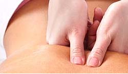
When choosing the colour palette, the designer should be mindful of the images used and the tones used within them, so often there will be natural tones to complement. To help with a harmonious colour scheme, the photographs used can involve a composition that includes the range of colours in the palette, or one that emphasises one natural colour that complements the overall scheme. The images used within an osteopathy website will include those of treatments taking place, images that show the hand-on approach can be clear and effective at explaining their work. e.g. Back Treatment.
Finally, shapewise an osteopathy website will tend to be more geometric or solid than, say a reflexology website. The designer should be mindful though that a human, inviting and welcoming appeal is important as well as a professional image.
Example Osteopathy Websites
Here are some examples of osteopathy websites. Some have been created as bespoke designs by members of the Griffen Mill team, whilst others are built on a generic design which we created.
On 8 October 2010 Margaret Gul Osteopathy relaunched their website www.southmanchesterosteopath.co.uk after an A La Carte redesign by our designer Paul. The client was open to considering a variety of look and styling, but with a preference for curves and organic flow. See full press release