
Natural Health Clinic Website Design - Shape and Aesthetics
Back to Natural Health Clinic Website Design Guide.
This is the Griffen Mill Design Guide to designing websites for natural health clinics. This section focusses on the use of shape and related aesthetic decisions. Other parts of the guide focus on choosing images, colour and making appropriate content and copywriting decisions. Click to return to the main guide.
Aesthetic choices for Natural Health Clinics
In our experience natural health clinicians have a preference for website designs that have a flow to them and organic looking smooth lines. This will often work better with images of people and treatments along with images of nature. Occasionally a clinician will prefer a more angular look perhaps it if fits well with a logo or a particular image they like. This might be diagonals or even something more linear yet with subtle curves, which can be better suited to a more corporate image.
Below we have shown a few examples of designs we have created, with some commentary explaining the design rationale, which you may find useful in seeking inspiration for your own ideas.
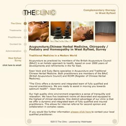
Calm and Professional
This design has a clear and professional layout that is gently framed with subtle lines. The warm background tone complements the natural skin colours found within the treatment images. The design is based around the clinics logo, with all the design features flowing from this element. This professional and grounded approach appeals to both individual clients and businesses alike.
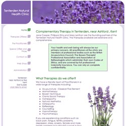
Bright & Energetic
This design has a simple and sophisticated appeal that is elevated by the natural vibrant colours of the lavender flowers that are a key feature to this Natural Health Clinic. The design is balanced with green tones within the headings and quote boxes to create an overall gentle and yet energetic appeal.
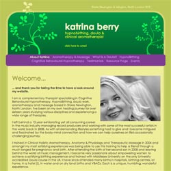
Personal & Vibrant
This third natural health clinic website example uses a more vibrant colour palette against delicate plant silhouettes, which balance the header area. Simple curved corners to the framework separate the lighter content area from navigation menu and header. As the client does not have a distinctive logo, the heading area can be busier as it does not risk distracting so much from a logo.