Life Coaching Website Design - Using Colour
Back to Life Coaching Website Design Guide.
This is the Griffen Mill Design Guide to designing websites for life coaches. This section focusses on the use of colour. Other parts of the guide focus on choosing images, and making appropriate content and copywriting decisions. Click to return to the main guide.
Colour for Life Coaches
As with any website and client, individual client preferences are paramount, however in our experience certain colour choices and palettes are more popular with life coaches and counsellors. These tend to be colours associated with a calm, inviting and neutral outlook, such as blue and turquoise. Rarely would we create a life coaching website with vibrant colours such as pink and red, which may not create the right feel to its visitors. There is always a balance to be met when designing for life coaches, as the website aims to be professional and grounded, yet it is also vital to create a positive and inviting appeal, sensitive to the nature of the client's work.
Another factor that will of course influence colour is the image choice, and life coaching websites are likely to include images that convey a sense of journey, a sense of freedom, an open landscape or natural scenery. It is key therefore to ensure your palette complements this.
Colour Palettes for Life Coaches
There are a number of tools online which are suitable for experimenting with and choosing colour palettes. Here are a few that we have used often for life coaching websites. Different therapists will have a leaning to different styles of palette, depending on whether they wish to present a more individual and vibrant look or something more low key and businesslike.
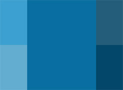
Option 1: Smart Monochromatic
This scheme is based on a single colour tint, and uses only variations made by changing the saturation and brightness. A life coach may wish to use this scheme to maintain a consistent design, in-keeping with their logo or existing business literature. These blue shades also complement well with natural images of the sky or sea, which we have found to be regularly used within life coaching websites.
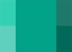
Option 2: Soft Monochromatic
A green/turquoise monochromatic colour palette can be a little more neutral than that of the blue. The use of lighter shades as a background tone along with darker headings will balance the design well. A more saturated turquoise used as an accent colour can complement a monochromatic design by highlighting certain elements well.

Option 3: Cool Contrast
This palette is based upon the calm and cool blue shades of the monochromatic scheme, which is a range used often for life coaching websites. This gentle and professional tone is complemented well by use of a contrast colour. In this case a warm shade from the opposite side of the colour wheel will balance the design. These warm shades can be used carefully as an accent colour within the website, for use in subheadings or links. It is important to ensure the contrast shades are used delicately so as not to overpower the design.
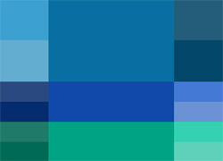
Option 4: Cool Complement
This colour scheme uses an analogic model, which complements the primary colour with its adjacent colours set at either side on the colour wheel. By using a tone only 20 degrees from the primary colour, a natural and elegant cool complementing scheme is created. These calm and gentle colours are perfect for a life coaching website as they create a safe and inviting appeal, whilst maintaining a professional and grounded outlook.