Physiotherapy Website Design - Shape and Aesthetics
Back to Physiotherapy Website Design Guide.
This is the Griffen Mill Design Guide to designing websites for physiotherapists. This section focusses on the use of shape and related aesthetic decisions. Other parts of the guide focus on choosing images, colour and making appropriate content and copywriting decisions. Click to return to the main guide.
Aesthetic choices for physiotherapists
In our experience physiotherapists have a preference for website designs that have a geometric, solid style or only subtle organic elements. Often a physiotherapists will prefer a more angular look that complements a practice logo or a particular image they like. This might be diagonals or even something more boxy which can be better suited to a more corporate image. Therapists may wish to offset a very clinical and hard edged design with a softer natural image of people that suits the colour scheme.
Below we have shown a few examples of designs we have created, with some commentary explaining the design rationale, which you may find useful in seeking inspiration for your own ideas.
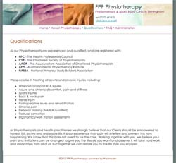
Strong and Professional
This design uses a bolder colour palette to create a clean and informative design specific to the the practitioners area of work. The colour scheme flows from the image through the site within elements such as the headings and emphasised text. The strong image is softened by the gentle curves brought into the layout design within the navigation menu and header break.
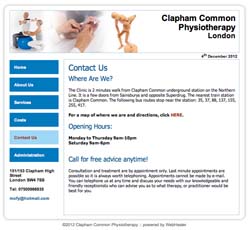
Simple and Sophisticated
This design has a clean and clear set up along with a simple monochromatic colour scheme that complements the header images. A professional white background tone along with a geometric layout design sets out an informative design that highlights the medical approach to a physiotherapists work.