
Physiotherapy Website Design - Using Colour
Back to Physiotherapy Website Design Guide.
This is the Griffen Mill Design Guide to designing websites for physiotherapists. This section focusses on the use of colour. Other parts of the guide focus on choosing images, and making appropriate content and copywriting decisions. Click to return to the main guide.
Colour for Physiotherapists
As with any website and client, individual client preferences are paramount, however in our experience certain colour choices and palettes are more popular with physiotherapists. These tend to be colours associated with calm and warmth along with a sense of energy and well-being, such as reds and blues or softer and warmer skin tones. Rarely would we create a physiotherapy website with sharp vibrant colours such as pink and yellow, which may not create the right feel to its visitors. Physiotherapy websites are better suited to a slightly more "medical" feel. Although, there is always a balance to be met when designing for physiotherapists, as the website aims to be professional and grounded, yet it is also vital to create a warm and inviting appeal, sensitive to the nature of the client's work.
Another factor that will of course influence colour is the image choice, and physiotherapy websites are likely to include images of positive and active people, specific target areas that are typically treated by the practitioner, or ones of treatments taking place. It is key therefore to ensure your palette complements this.
Colour Palettes for Physiotherapy
There are a number of tools online which are suitable for experimenting with and choosing colour palettes. Here are a few that we have used often for physiotherapy websites. Different therapists will have a leaning to different styles of palette, depending on whether they wish to present a more individual and vibrant look or something more low key and businesslike.
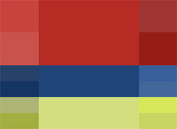
Option 1: Bold and Complementary
We find that a bolder colour palette is often used within physiotherapy website design. The colour red particularly stands out to the visitors of the site, it aims to grab their attention. When used with softer complementary tones, this can balance the design and lead to an overall calmer effect. It is important to keep in mind the business logo and literature so that the scheme can provide the right framework to the website and ensure that the practitioners business details are clear and informative.

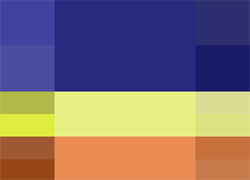
Option 2: Calm and Strong
This palette has an overall calmer appeal. The professional blue shades are strong and confident against the softer yellow that complements. Starting from these basic colour choices, the palette shown gives the option of choosing more muted shades of blue and beiges or richer more vibrant choices. The complementary yellows can be used for links or subheadings, although bright yellows are best used in moderation (e.g. links) rather than for headings which could be shades of the main text colours.
Option 3: Bold with Warm Skin Tones
It is important to keep in mind the nature of the clients work. So with this colour palette a warmer skin tone is brought into play. This is a palette based on an triad colour palette, which utilises the adjacent angles of the contrast colours within the colour wheel. This ensures a softer contrast that is easy on the eye. Using a cooler tone of 40 degrees hue as the reference colour, this may be very well suited to a physiotherapist, as it allows for skin tones to fit alongside deeper, cooler tones. If the client wishes a warmer palette, then a hue of around 40-50 degrees would include even warmer oranges and yellows.