
Psychotherapy Website Design - Photographs and Images
Back to Psychotherapy Website Design Guide.
This is the Griffen Mill Design Guide to designing websites for psychotherapists. This section focusses on the use of photographs as well as images such as diagrams or illustrations. Other parts of the guide focus on colour, shape and aesthetic designs and making appropriate content and copywriting decisions. Click to return to the main guide.
Images and Photographs for Psychotherapists
In most cases, a psychotherapist will wish to convey a professional and inviting impression with their website. They will also be looking to emphasise a safe and trustworthy environment and give a reassurance that they can bring the client a sense of well being. Depending on the client, some psychotherapists will wish to convey a more therapeutic image, using photographs of clean and professional looking treatment rooms with comfy chairs and an inviting environment for where their work takes place. Others will take a softer approach, using images of natural landscapes and vistas that will help to create a calm and relaxed impression to their visitors.

Sourcing Images for a Psychotherapy Website
You can take them yourself, but these days online image libraries are a fantastic resource of high quality, low cost and immense choice. In fact there are so many images online, that it is useful to experiment with keywords to find just what you are looking for.
The obvious starting point for an image for a psychotherapy website is to search for psychotherapist or psychotherapy. However depending on how the photographer has tagged their image, it won't find everything that you may be looking for. Try searching for dialogue or talking perhaps. The other approach you can take is to type in mood keywords such as relax, as the emotional content of the website is all important.
A short list of words you might try for a psychotherapist may include: support, treatment, dialogue, counselling, counsel, speaking, health, group, healing, calm, conversation, balance, well-being, psychologist, advice and listening.
We often use Shutterstock for images for psychotherapy websites, as we find they have a good range of high quality photographs.
Example Images for Psychotherapy
Finally, we have included below a number of typical images we might use with a psychotherapy website. These images are not intended for you to copy and reuse, in fact there are likely to be copyright problems with you doing that. However we have included commentary on how we feel these images suit a psychotherapy website, so that you can take inspiration from them and find your own individual images.
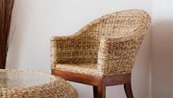
Comfortable Space
Images such as these, of comfortable and inviting seating, are used often within psychotherapy websites. Including an image of a clients actual practice room can help visitors to see the environment in which treatment will be undertaken, and may help to put them at ease. A client may also wish to complement their website design and other business literature with the colours found within their treatment space to create a theme through the business literature, which may develop their practice branding.

Space & Freedom
This image provides a feel for the human side of a psychotherapists work. With a use of gentle tones and sense of energy from within the image and posture of the subject, it can be used to illustrate the sense of well-being that the practitioners work aims to achieve.

Delicate Flowers
Not all images used within a psychotherapists website design need to be of people or practice spaces. An image such as this of a delicate daisy can help to create a lighter feel to the design. It is important to choose images that fit with the colour scheme, for a harmonious design.
Anneli Nilsson employed the services of one of Griffen Mill’s Gold designers for her Psychotherapy and Counselling website. It is a great design with a very crisp and clean feel and the feature images have a real impact. They illustrate the site beautifully with calming seascapes and relevant yet thought provoking scenes. The only other image on the site is a portrait photo of Anneli which is recommended and being a way of increasing a sense of familiarity with the potential client and has also been proven to encourage that initial contact. The site has a very elegant and professional feel which will also be reassuring to the potential client who is looking for help. These observations and comments were made on September 16th 2016 – the website may have been updated since then. www.anneli-nilsson.com
Charley Shults has chosen one of WebHealer’s slightly older designs for his psychotherapy and counselling business website and this design is not a mobile responsive one. He has gone on to tweak the colour scheme, giving it a neutral feel with a grey background and blue text which complement each other well. He has also added a selection of images, most with a natural element which is a popular choice for a counsellor’s website as it is said to convey a sense of calm and peacefulness. It is a good idea to create a common visual language with your website, trying to match a range of similarly themed images and colour scheme, and Charley does this well. These observations and comments were made on July 8th 2016 – the website may have been updated since then. www.CharleyShults.co.uk
Chris Gore has chosen a standard WebHealer mobile friendly design for his counselling and psychotherapy website. There's a natural colour scheme in shades of green, with a feature image of a silver birch tree in woodland, with sunlight bursting through the trees. He's also used some of his own images to complement this, including a good quality self-portrait taken in a natural setting, and an image of his very natural-looking and tranquil garden consulting room. Taken together these images convey a sense of solidity, calmness and peace which would be very reassuring to a website visitor looking for a counsellor or psychotherapist. These observations and comments were made on July 27th 2016 – the website may have been updated since then. www.chrisgorecounselling.com
Jahque Price-Rees’ website is using a mobile responsive design from WebHealer’s Bronze selection of designs. These designs can be customised to add your own feature image and also colour scheme tweaks. Jahque has decided to use one of WebHealer’s feature images which is a lovely picture for a counselling and psychotherapy site. The natural element conveys a calm atmosphere while the curvy stone path suggests a journey taking you around a corner of your life. She has then gone on to add further images to her pages, and has kept a natural theme and also consistent colour scheme so all the images and design colours complement each other. To create a website that is pleasing to the eye needs a common visual language and has been proven to engage a reader for longer. These observations and comments were made on July 15th 2016 – the website may have been updated since then. www.counsellingconsultancy.co.uk
Elise Wardle has opted for one of WebHealer’s mobile responsive designs for her counselling website. It is one from their Bronze range, which she has gone on to customise herself. She has added her own feature image and has then set the colour scheme to match to give a consistent and complementary feel to the site. Elise has also added an image of herself to the Home page which is a great idea as potential clients feel more comfortable in making contact with a therapist if they can see what they look like. It is a good idea though to make this image quite subtle and in line with the text and not too large where it can dominate the page. These observations and comments were made on July 13th 2016 – the website may have been updated since then. www.elisewardle.co.uk
Jayne Burrows has chosen one of WebHealer’s older designs for her counselling and psychotherapy website. It strikes you as being professional and consistent and the white colour scheme has a pure and clinical feel to it. Jayne has added an image of herself to the Home page which helps to give a sense of familiarity and personalisation to it. She could then build on this, by adding further images to her website which will help to add extra interest to the text on the page making it more appealing and easier on the eye. It is also considered good practice to try to match the colours or style in your images to the visual language of the website as this helps to create a sense of balance which is likely to encourage a visitor to remain on your website for longer. These observations and comments were made on March 15th 2016 – the website may have been updated since then. www.jburrowspsychotherapy.co.uk
Jonathan Mason's counselling and psychotherapy website uses a calm and neutral colour scheme of soft greens and earthy browns. Jonathan has used a number of strong images to create a feeling of peace, but also of hope and empowerment. His feature image for example is a solitary birch tree in a woodland setting with the sun shining through the leaves behind it. Another shows a quiet woodland glade where bracken is lit up by a sudden ray of sunshine. In another a lonely road winds through an autumnal wood, which is ablaze with uplifting oranges and yellows. He also cleverly matches images with his content – for example his 'How I can Help' section is accompanied by an image of stepping stones, which subtly references the idea of counselling and psychotherapy being a series of small steps that can help you to reach the other side of a problem. These observations were made on December 15th, 2015 – the website may have been updated since then. www.jonmasoncounselling.co.uk
Mary Mcilroy's counselling and psychotherapy website has been built on a mobile optimised design layout in soft greens. She has combined this with charcoal text and gold subtitled text and carefully selected images which compliment this colour scheme and which add visual interest. Her feature image of a beech tree in dappled sunlight includes charcoal and flashes of gold and on the homepage Mary's portait image cleverly picks these up in the gold of her hair and the charcoal background. These same colours are also repeated in images elsewhere on the website in the form of a yellow/gold pencil erasing a teardrop on a charcoal drawing, for example, or a hot-air balloon with yellow/gold panels. The overall effect is soothingly harmonious. These observations were made on 5th May, 2016 – the website may have been updated since then. www.m-mcilroycounselling.co.uk
Martyn Hone's psychotherapy and counselling website creates a first impression that is friendly and vibrant. Cheerful orange is teamed up with summer-sky blue to achieve this effect, and the colour scheme is then echoed in the images that Martyn has added to his pages. Colour has a powerful affect on our attitudes and emotions, in fact our response to the visual stimulus of colour influences the release of hormones and hence our mood and behaviour. The use of this particular colour scheme therefore helps the reader respond positively to the website, which is essential for a counsellor making a first impression. Martin has also included a good sized photograph of himself which seems to make eye contact with the reader and reinforces the message that he is approachable and reliable. These observations were made on December 10th, 2015 – the website may have been updated since then. www.mh-counselling.com
Natalia Peace has chosen WebHealer's standard design Social ColourMAX for her Counselling and Psychotherapy website. She has used a natural and calming feature image throughout the website of a rowing boat on a lake, to reflect the counselling journey, and has used other calming images from nature, and of her counselling rooms, to add further interest to the website. She also has displayed some welcoming portrait images which establish a personal connection with the website visitor, and encourage contact. The muted and calming colour scheme she's chosen also complements her images very well. These observations and comments were made on May 18th, 2016 - the website may have been updated since then. www.nataliapeacecounselling.com
Nicky Callus has chosen WebHealer's Curvy ColourMAX design for her counselling and psychotherapy website, based in Haywards Heath, Mid Sussex. The calming water droplet theme is echoed on her About Me About You page, where she's used a lovely lotus flower image, along with a good quality, welcoming portrait image. Often it's a good idea to put a portrait like this onto the home page so a website visitor feels an immediate connection with the therapist. The website colours also blend well with the main feature image, and a slightly larger than average font is used throught the website, which makes her wording very clear and easy to read. These observations and comments were made on March 11th 2016 and the website may have been updated since then. www.nickycallus.com
Pentagram Counselling & Psychotherapy are using one of Webhealer’s slightly older designs for their website. The colours though are perfect for a Psychotherapy website as green is said to provoke a sense of balance, growth and self reliance. The heading image of a couple walking in a park also fits with this and adds a calming essence to the site. Anthony has built on this natural theme with the extra images he has added of flowers and the outside of his practice room. These observations and comments were made on November 19th, 2015 - the website may have been updated since then. www.pentagramcounselling.co.uk
John Colverson's psychotherapy website is based on a standard WebHealer design. John chose a theme of soft and natural greens with a nature based feature image which is echoed with similar nature based images of his own on some of the inner pages. This featured image of sunlight through trees is a very popular metaphor for psychotherapy websites, as it conveys a sense of hope and optimism as well as connecting with the simplicity of nature. Ideally with images it is good to maintain a common visual language throughout the website, so even though every image might not be of trees or flowers the object of the picture might be in a natural setting. Observations and comments made on October 17, 2015 - the website may have been updated since then. www.psychotherapyinlondon.co.uk
Stephen Weaver has opted for a Silver Action Hero design for his counselling and Psychotherapy website which incorporates a large feature image at the top of the pages. The images he has chosen create an immediate sense of impact conveying a subtle strength that doesn’t detract from the message he is putting across to his potential clients and how he can help them. The colours are soft and have a consistent tone which complements the images perfectly and gives a tranquil and secure feel to the website. These observations and comments were made on February 4th 2016 and the website may have been updated since then. www.ryetherapist.com
Sally Bunce is a psychotherapist and counsellor and she has chosen a perfect colour scheme for her mobile friendly WebHealer website for her line of work. The use of blues are said to convey a sense of peace and trust as well as loyalty and integrity. She has built on this emotional foundation by adding a series of naturally themed images which contributes to the calm and reassuring feel and also helps to create a common visual element to her website. These observations and comments were made on October 30th 2015 – the website may have been updated since then. www.sallybuncetherapy.co.uk
Steve Barker has made consistent and considered use of images in his psychotherapy website. On each page a separate image has been placed with a deliberate non verbal message designed to complement the theme. Popular metaphors have been used such as a 'clear path ahead' for the counselling page. Although such images risk being a cliche, careful choice can reinforce a positive message very effectively. www.stevebarkercounselling.com
Steve Silverton is using one of the standard mobile friendly designs of WebHealer for his psychotherapy website. He has chosen a calm and natural colour scheme with earthy tones and is using a feature image of sunlight through a woodland. He has added to this by including extra images of woodland and the countryside within his content which maintains a consistent and reassuring theme. Images of the natural world are very popular with websites for counsellors and psychotherapists as it conveys a sense of balance and inner calmness away from the stresses of everyday life. These observations and comments were made on October 28th 2015 – the website may have been updated since then. www.stevesilverton.co.uk
Zee Finch's counselling and psychotherapy website uses a feature image which depicts two deck chairs sitting companionably, side by side, on a sunny beach. This is a very appropriate image for a business that is based by the sea, in Hove. This image also works on several other levels also – not only does the tranquil setting of the empty beach convey a sense of peace and quiet but the close proximity of the chairs to each other also evokes a feeling of harmony and trust; whilst the pebbles on the beach reinforce the idea of breaking problems down into smaller and smaller pieces. The deck chair image is also a good choice for a therapist who works with adolescents as well as with adults as the cheerful blue and white stripey fabric will appeal to all age groups, being evocative of summer holidays and happier, less complicated times. These observations were made on December 21st, 2015 – the website may have been updated since then. www.zeefinchcounselling.co.uk