
Designing Websites for Psychotherapists
This is the Griffen Mill design guide to designing websites for psychotherapists, part of our website design guide series. Over the years, psychotherapists and counsellors have represented the largest category of clients for the design team within Griffen Mill. The individual designers within Griffen Mill have created websites for a huge number of psychotherapists, via our key client WebHealer. Unlike many of the body therapies, the tone of a psychotherapy website tends to be more serious, with more of a clinical leaning. Colours tend towards more muted tones and images must be carefully selected as it is very easy to trigger the wrong emotional reaction in a website visitor.
Guide Structure
This guide, like most in this series, has the following key sections.
- Typical design requirements for psychotherapy websites
- Choosing colour for psychotherapy websites
- Shape and related aesthetic decisions
- Images and photographs for psychotherapy websites
This guide continues with section one, and you may use the above links to read more about later sections, which will go into more detail. In each case, the approach used to communicate our ideas leans towards examples, such as examples of images useful for a psychotherapy website or palettes that often appeal to psychotherapists.
Typical design requirements for psychotherapy websites
Although each psychotherapist will have their individual preferences in terms of style, colour palette and imagery, certain common traits appear more often in psychotherapy website design. Very often, the client is aiming at a professional and clinical appeal, using a cool colour palette that uses natural tones, such as blue or green. When done well this will help evoke a sense of security and comfort.
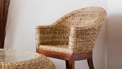
When choosing the colour palette, the designer should be mindful of the images used and the tones used within them, so often there will be natural tones to complement. To help with a harmonious colour scheme, the photographs used can involve a composition that includes the range of colours in the palette, or one that emphasises one natural colour that complements the overall scheme. The nature of the images used are to focus on a calm and inviting feel. Often, psychotherapists may wish to use images of comfortable and inviting seating such as those used within their practice room. e.g. comfortable chair.
Finally, shapewise a psychotherapy website will tend to be more geometric or solid than, say a reflexology website. The designer should be mindful though that a human, inviting and welcoming appeal is important as well as a professional image.
Charley Shults' Attachment Centered Therapy website uses WebHealer's mobile friendly Mobile ColourMAX standard design for his therapy website. The stepping stones image gives the encouraging impression of a path leading on, and the harmonised muted colour scheme also goes well with his portrait image. The text content has been nicely formatted in the main, and also uses quotation boxes to break up the text, all of which has the effect of making it easier to read and digest. These observations and comments were made on June 27th 2016 – the website may have been updated since then. www.attachmentcentredtherapy.co.uk
Social ColourMAX is the design of choice for the website of Clear View Counselling and Psychotherapy. Carrie has then added her own feature image in the side of the design and has customised the colour scheme to blend in with it, giving the site as a whole a consistent and free flowing feel. She has also added other images to her pages which visually enhances the paragraphs explaining the issues that she can help with and has the added benefit of making the website easy on the eye and easy to read though. This is a great way of helping people to stay on your website page. These observations and comments were made on July 21st 2016 – the website may have been updated since then. www.clearviewcounselling.co.uk
Bernadette Turner of Complete Counselling has chosen a mobile friendly self-customising option for their latest counselling and psychotherapy website design. The calm colour scheme conveys a feeling of growth and development which is a popular choice for a psychotherapy website. The feature image of the design of a tree in a woodland also echoes this sense of growth and the sunlight filtering gently through the trees adds a therapeutic atmosphere to the site. Observations and comments were made on November 18th, 2015 - the website may have been updated since then. www.counsellinginbirmingham.co.uk
Augene Nanning’s website is a mobile responsive design that she has customised herself. She has opted for one of WebHealer’s feature images of a meandering stepping stone path that your eyes naturally follow as it winds around a corner which is very apt for a counselling website and those on a personal journey. Augene has then picked up the natural greens in the image and has used these as the base for her colour scheme giving a consistency to the tone and style of the site. Green is a great colour for that of a psychotherapist as it is said to relay a sense of growth and self reliance. These observations and comments were made on May 17th 2016 – the website may have been updated since then. www.counsellorandsupervisor.co.uk
The counselling and psychotherapy website of Dimitri Raftopoulos was created for him by one of our Gold designers. It has a very clean and professional tone with a simple yet effective layout. The colour scheme of the heading is repeated through the website pages and is picked up in the images that have been added to the pages to illustrate the theme and content within. This gives the website an overall consistent and dependable feel which echoes the style and mood conveyed by the colour scheme. The subtle blue and rose colours have been said to instil a sense of trust and down to earth security which is ideal for the website of a psychotherapist and Dimitri’s website is a great illustration of this. These observations and comments were made on May 6th 2016 – the website may have been updated since then. www.dimitriraftcounselling.com
Elisabeth Auer is a counselling psychotherapist working in Twickenham. She often works with distressed clients offering trauma counselling and so she has chosen to keep her website very simple with lots of white space and a gentle colour scheme of tranquil blues and calming greens. She keeps the use of images to a mimimum, using just a few subtle photographs to add interest. Typically these depict calming scenes from nature such as a pathway meandering through sunlit parkland, a cliff top walk overlooking the sea, or the park benches in Twickenham Green. All of which help to reinforce her message that psychotherapy provides time for reflection as well as being a safe and supportive environment in which to talk through thoughts and problems. These observations were made on December 21st, 2015 – the website may have been updated since then. www.eatherapy.co.uk
This counsellor has chosen a neutral and professional colour palette of greens as a backdrop to her professional practice counselling and psychotherapy website. She has thoughtfully chosen a monochrome black and white portrait photograph for the sidebar which avoids any distracting colour clashes and ensures the reader's focus is not distracted from the content. www.evelyngauntcounselling.co.uk
Eleanor Wildy has chosen a Silver design for her psychotherapy and counselling website. It is the Super Hero design which incorporates a large feature image at the top of the pages which can also contain some overlaid words. Eleanor has chosen a natural scene for this feature image with a strong leading colour. This has been picked up and used throughout the colour scheme of the site. The colour purple is said to convey a sense of creativity and individualism and the natural element of the image brings in a calming sense of order and tranquillity which is very appropriate for a therapy based site. These observations and comments were made on February 12th 2016 and the website may have been updated since then. www.ewcounselling.co.uk
The Gestalt Therapy and Counselling website of Piotr Mierkowski uses one of WebHealer’s mobile friendly standard designs which he has customised himself with his own logo. The logo sets the basis for the whole design as the background has been picked out from the logo image and he has then personalised the colour scheme by choosing a couple of key colours giving a balanced and harmonious feel to the site as a whole. www.gestalttherapist.co.uk
The website design for Allan Eno’s “Psychotherapy at Harley Street” website was created for him by one of WebHealer’s pre Gold design business partners. The design still looks great though and has incorporated Allan’s logo into the design. The simplicity of the black and white graphic has been picked up really well in the main design concept with the blue giving a splash of colour to complement it. It can help to add further images to your pages which helps to break up the paragraphs of text and these can also enhance and illustrate your message. It is important though to have a consistent theme be it of colour, style or topic. These observations and comments were made on May 17th 2016 – the website may have been updated since then. www.harleystreetpsychology.co.uk
The WebHealer Mobile ColourMAX design is Lia Brown ‘s choice for her Psychotherapy and Counselling website. It is a clean and modern design and as the name suggests is optimised for use on mobile phones and tablets. She has chosen to stick with their example logo and suggested colour scheme which gives a harmonious and balanced feel to the whole site. www.liabrown.net
The Social ColourMAX design is Mary Murphy’s choice of design for her counselling website for her practice in Cork. It is a modern design that is optimised for use on mobile phones and tablets and also for those using social media platforms. May has tweaked the standard colour scheme to add some personalisation and individuality to it while ensuring the colours continue to complement the logo image making it a very clean and natural look. www.marymmurphy.com
Devang Vaidya has chosen one of WebHealer’s mobile friendly designs from their standard range for his London based counselling and psychotherapy website. The Social ColourMAX design is modern and has a fresh feel about it and he has tweaked the colour scheme to give it a personalised touch. He has decided to keep one of their stock logo images and the colour scheme complements this very well. www.newrivertherapy.com
The counselling and psychotherapy website of Niki Ridgley is using one of the mobile responsive Bronze designs from WebHealer. She has opted to use one of their supplied feature images of a stone path meandering through an implied woodland area. The related colour scheme gives off a sense of tranquillity and the site has a consistent and calming feel as a result. Niki has then gone on to add images of herself and her treatment room which is a great idea as it can encourage potential clients to make contact as they feel they have already made the acquaintance of the therapist and her working space. These observations and comments were made on May 5th 2016 – the website may have been updated since then. www.nikiridgleycounselling.com
Gerrie Hughes of the Mind & Body Coaching and Counselling website has opted for one of WebHealer’s Bronze designs and a mobile responsive one which is important as the majority of internet searches is now done on a smaller screen such as a mobile or a tablet. She has also used one of the feature images that are supplied with the design, and this a great image of a curving stone path meandering through a wood. It conveys a message of taking a journey and the natural element that is also suggested adds a feeling of calm and tranquillity. Gerrie has then added further images to her pages to help to illustrate her message and introduce herself to her potential clients. These observations and comments were made on July 15th 2016 – the website may have been updated since then. www.psychotherapycardiff.co.uk
Simon Weber’s counselling and psychotherapy website has been given one of WebHealer’s Bronze designs which is also one of their mobile responsive designs. This is important in today’s age as the majority of internet searches is now undertaken on a small hand held screen such as a mobile phone or a tablet. Simon has opted to stick with the feature image that is supplied with the design of a lovely stone path meandering through a wood or park. This implies a journey is being taken as your eye is lead around the corner and your min naturally what is there. This is very apt for a therapy website which adds a comforting feeling to the website. These observations and comments were made on July 28th 2016 – the website may have been updated since then. www.psychotherapymelbourne.net
The website for Quiet Mindz is using a Bronze design of WebHealer and it is one of their mobile responsive designs. Paul has opted to use one of WebHealer’s feature images and colour schemes and the two complement each other very well. The curving path implies a journey taking you around a corner and the down to earth natural colour scheme is ideal for a counselling website and those seeking psychotherapy as it is neutral and emits a calm and serene atmosphere. These observations and comments were made on May 12th 2016 – the website may have been updated since then. www.quietmindz.co.uk
Juliusz Wodzianski from Talk Therapy London is using a standard design which is mobile and tablet friendly for his psychotherapy and counselling website. The colour scheme is gentle and calming and the meandering stone path in the feature image is mimicked in the design framework with further gentle curves. This natural element form the image married with the soft pastel colours are ideal for a therapy website as they help to instil a sense of calm and tranquillity which can be important when you are plucking up courage to make contact. These observations and comments were made on March 10th 2016 – the website may have been updated since then. www.talktherapylondon.com
The website of Bethnal Green Counselling is using an A La Carte design. This design service has been super ceded by the Silver Design service but this is still a great website design. The natural feature image at the top of the page gives a light and fresh feel and you can almost imagine yourself sitting in the sun. This helps to instil a sense of calm and peaceful ness which is great for a counselling site. The colour scheme has been left mostly neutral to allow the image to stand out, with just a hint of colour added to add emphasis and continuity to the site. These observations and comments were made on July 29th 2016 – the website may have been updated since then. www.shoreditchcounsellingandpsychotherapy.co.uk