
Psychotherapy Website Design - Shape and Aesthetics
Back to Psychotherapy Website Design Guide.
This is the Griffen Mill Design Guide to designing websites for psychotherapists. This section focusses on the use of shape and related aesthetic decisions. Other parts of the guide focus on choosing images, colour and making appropriate content and copywriting decisions. Click to return to the main guide.
Aesthetic choices for Psychotherapists
In our experience psychotherapists have a preference for website designs that have a geometric, solid style or only subtle organic elements. Often a psychotherapist will prefer a more angular look that complements a practice logo or a particular image they like. This might be diagonals or even something more boxy which can be better suited to a more corporate image. Psychotherapists may wish to offset a very clinical and hard edged design with a softer landscape or natural image that suits the colour scheme.
Below we have shown a few examples of designs we have created, with some commentary explaining the design rationale, which you may find useful in seeking inspiration for your own ideas.
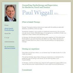
Clean, professional and inviting
This design incorporates a professional, corporate look that emphasises the medical approach to the psychotherapists work. This soft and elegant design incorporates an image of the psychotherapist, which we find an important feature to any psychotherapy website. The image provides a welcoming appeal by putting a face to a name, which may help to bring more enquiries to our clients.
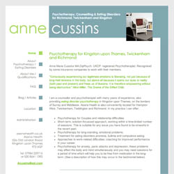
Personal and inviting
This website design provides a little more vibrancy, balanced with complementing soft tones that frame the content smartly. The design is built around the psychotherapists simple and sophisticated logo, creating a clear and professional outlook. Whilst the overall shape of this website is very linear, the gentle dynamic shapes within the header softens the design and injects a splash of colour into this sophisticated design.
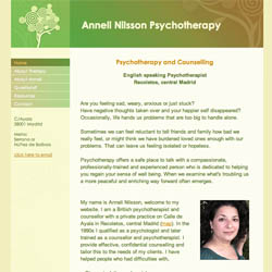
Clear and informative
This design creates a calm and inviting appeal by way of a delicate balance of complementing natural colours. This fundamentally geometric layout is softened by the small header image that breaks up the colour block, where the colours are balanced into the content text and headings to bring the design together.
Angela Pope's counselling and psychotherapy website has a very pleasing shape, with a broad (resizeable) heading along the top, an elongated 'content' area on the left, and small boxes with individual snippets of information in the sidebar on the right. It uses a tranquil, non-intrusive colour scheme of grey and pale mauve, which is then given interest and just the right degree of vibrancy through the use of a hot pink in the feature image and in the navigation bar. This helps to unify the design and acts as a good foil for her multi-coloured professional logos in the sidebar area. These observations and comments were made on September 8th 2016 – the website may have been updated since then. www.angela-pope.com
The psychotherapy and supervision website of Candice Johnson was created for her by one of Griffen Mill’s Gold designers. It is a great design and has a clean professional tone with a simple yet effective layout that incorporates Candice’s logo into the main heading area. The background of her portrait image matches the colour scheme of the design and the icons on the pages are distinctive yet subtle and really enhance the page content. The website conveys a calm sense of space which suggests you can take your time to read it. These observations and comments were made on July 28th 2016 – the website may have been updated since then. www.candicejohnson.co.uk
The design of Deirdre Frondigoun’s counselling and psychotherapy website has been created by one of our Gold level designers. The simplicity of the layout and design is great as it draws you into the content area of the pages where Deirdre has also placed an image of herself. This is great as it helps to create a sense of familiarity between the potential client and the therapist. The gentle curve in the design adds a natural break between the heading area and the content area and this curve has also been picked up and applied to the other images that Deidre has added throughout her pages. Consistency throughout a website is very important as it means the reader can focus on the content rather than taking in new design elements. These observations and comments were made on March 11th 2016 – the website may have been updated since then. www.dfcounselling.com
Dharma Paul has chosen the WebHealer Mobile ColourMAX design with a muted calming colour scheme for his Counselling and Psychotherapy website. He has nicely customised the design by embedding his own image of water flowing over stones into the design, which also has a wavy, curvy feel to it. So design and image harmonise well, while the website is still optimised for use on all sizes of screen including mobile phones. www.dharmapaul.co.uk
Matt Hancocks has chosen WebHealer's mobile-friendly Mobile ColourMAX design for his website to promote his Yorkshire based counselling and psychotherapy service. The main feature image of stepping stones invites the visitor to imagine moving forward in their life, while the curve of the path echoes the curves in the background of the design. The wording that's used is presented in clearly separated paragraphs, which are also easy on the eye. The various pages of the website mainly use bold sub-headings as well to emphasize this separation, and the overall effect is to give the website a good shape on the page, which makes it very readable and easy to understand. These observations and comments were made on March 11th 2016 – the website may have been updated since then. www.hancocks-counselling.co.uk
Kate Heavey, who provides psychotherapy and counselling in Surrey, has opted for our mobile friendly Mobile ColourMAX design for her Harmonious Counselling website. She has achieved an excellent design balance on her website, with both the feature image and her own portrait having a strong natural outdoors theme and similar colours. These images balance each other too left and right on the page, and her use of centred images and centred boxed headings throughout the rest of the website nicely maintains this feel. Observations and comments were made on April 29th, 2016 - the website may have been updated since then. www.harmoniouscounselling.com
Julie Hardy's Psychotherapy and Creative Arts Therapy website uses a simple design with navigation at the top and contact details down the side, which leaves her lots of scope to add interest through shape. She uses a peaceful palette of white against a pale blue background which is enhanced by a orderly pattern of squares in blue, white and tones inbetween, and a number of rectangular quote boxes to display her content. In marked contrast to these however is her feature image of spiralling blue waves and a dynamic painting of coils and random swirls. This interesting conflict between order and chaos helps to underline and illustrate Julie's message that therapy can help make sense of unwanted changes in your life, or help you to manage difficult feelings or troubling behavour patterns. These observations were made on December 21st, 2015 – the website may have been updated since then. www.juliehardingtherapy.com
Teresa Sinani has opted for a bespoke design from one of WebHealer's Gold level designers, for her psychotherapy and counselling website, with a high quality welcoming portrait image featured in the website sidebar. This image establishes an immediate connection with her, and the design of the website is also appealing in its use of very modern fonts in the heading, and in the use of the peacock feather images to add a splash of colour. The texture of the feathers is also subtly reflected in the website heading background texture, and a good shape to the website content is maintained by clever use of separators and quote boxes in the website text. This projects a very professional yet friendly image, and encourages the visitor to make contact. These observations and comments were made on April 8th, 2016 - the website may have been updated since then. www.teresakain.co.uk