
Psychotherapy Website Design - Using Colour
Back to Psychotherapy Website Design Guide.
This is the Griffen Mill Design Guide to designing websites for psychotherapists. This section focusses on the use of colour. Other parts of the guide focus on choosing images, and making appropriate content and copywriting decisions. Click to return to the main guide.
Colour for Psychotherapists
As with any website and client, individual client preferences are paramount, however in our experience certain colour choices and palettes are more popular with psychotherapists. These tend to be colours associated with a calm, inviting and neutral outlook, such as blue and turquoise. Rarely would we create a psychotherapy website with vibrant colours such as pink and red, which may not create the right feel to its visitors. Psychotherapy websites are better suited to a more "medical" feel. Although, there is always a balance to be met when designing for psychotherapists, as the website aims to be professional and grounded, yet it is also vital to create a warm and inviting appeal, sensitive to the nature of the client's work.
Another factor that will of course influence colour is the image choice, and psychotherapy websites are likely to include images that convey a sense of space and freedom, an open landscape or natural scenery. It is key therefore to ensure your palette complements this.
Colour Palettes for Psychotherapists
There are a number of tools online which are suitable for experimenting with and choosing colour palettes. Here are a few that we have used often for psychotherapy websites. Different therapists will have a leaning to different styles of palette, depending on whether they wish to present a more individual and vibrant look or something more low key and businesslike.
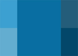
Option 1: Smart Monochromatic
This scheme is based on a single colour tint, and uses only variations made by changing the saturation and brightness. A psychotherapist may wish to use this scheme to maintain a consistent design, in-keeping with their logo or existing business literature. The use of lighter shades as a background tone along with darker headings will balance the design well. A more saturated blue used as an accent colour can complement a monochromatic design by highlighting certain elements well.
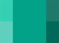
Option 2: Naturally Calm
This scheme offers a different appeal to that of the blue monochromatic option. The green tones may complement natural images well, whilst maintaining a universal appeal to a psychotherapists website design. The different tones can be used to highlight different elements of the design to create a smart balance.
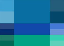
Option 3: Cool Complement
This colour scheme uses an analogic model, which complements the primary colour with its adjacent colours set at either side on the colour wheel. By using a tone only 20 degrees from the primary colour, a natural and elegant cool complementing scheme is created. These calm and gentle colours are perfect for a psychotherapy website as they create a safe and inviting appeal, whilst maintaining a professional and grounded outlook.
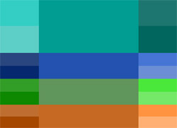
Option 4: Calm & Natural Contrast
This colour scheme introduces a blend of natural and complementary colours that maintain an understated website design, perfect for psychotherapists. The secondary colours must be used delicately to complement the primary colour, and are best suited to correspond with the tones within the websites' content images.
Aubyn de Lisle has chosen to use WebHealer's Mobile colourMAX design for her Counselling and Psychotherapy website but she has personalised it by adding her own logo image and portrait photograph. She has used a harmonious palette of warm blues and calming greens for the background design, but has also picked up and accentuated the warm terracota red in her logo, by using this same colour as the background in the portrait photo. Many psychotherapy websites choose a blue colour scheme because blue is associated with trust and integrity. Adding a small amount of red however creates just enough drama to be interesting, without detracting from the overall sense of calm. These observations were made on December 8th, 2015 – the website may have been updated since then. www.adlpsychotherapy.co.uk
Gary Smith has opted for a natural look for his mobile friendly psychotherapy website. The feature image of some stepping stones weaving a path through a wood is perfectly matched to the soft and subtle colour scheme. Natural themes are very popular for counselling and psychotherapy websites as this natural element helps to convey a sense of calm and relaxation which is enhanced by the earthy down to earth tones used here giving a very grounded and stable base. These observations and comments were made on November 6th 2015 – the website may have been updated since then. www.counsellingandcreativetherapy.co.uk
Action Hero is the design of choice for Stephen Weaver’s psychotherapy and counselling website. The design features a hero image at the top of each page and the colour scheme of the site has been carefully selected to enhance these images. The colours are soft and subtle and of a similar tone which has created a consistent and balanced feel to the whole site. The combination of blue, grey and a touch of gold work really well to convey a sense of trust and integrity and also of triumph and achievement which is perfect for the website of a psychotherapist. These observations and comments were made on February 4th 2016 and the website may have been updated since then. www.counsellingetc.co.uk
Edward J Silver has customised this website design with his own colour scheme. He has opted for a soft green that complements the feature image and is ideal for a counselling and psychotherapy site as green is said to instil a sense of balance, growth and self-reliance. He has also picked up on the natural essence of the feature image and has built on this by adding further images of natural settings to his other pages. It is recommended to try to match the colours in your feature image to the general style and colour scheme of the website as this creates a sense of balance that is intuitively pleasing to the eye of the viewer (or potential client). Edward has done this and has then added further colours to his content area which makes for bright and cheery pages, however care should be taken not to use too much variety. These observations and comments were made on December 17th 2015 and the website may have been updated since then. www.ejscounselling.co.uk
Enderby Associates are using a naturally themed design for their psychotherapy and counselling website. They have opted for the feature image of a tree in woodland with soft sunlight filtering through the trees behind, which gives off a calm yet optimistic feel. The colour scheme of soft greens fits with this natural image perfectly conveying a sense of growth and self-reliance which is very appropriate for the site of a psychotherapist and they have incorporated a hint of blue to give extra emphasis to the text in the heading area. These observations and comments were made on December 8th, 2015 - the website may have been updated since then. www.enderbyassociates.co.uk
The website for Harley Street Counselling and Training is a mobile friendly design from WebHealer called Social ColourMAX. It is one of their Bronze designs where the client can add their own logo image and also personalise the colour scheme. They have opted to use on the WebHealer’s logo images as the feature image and the varied blue colour scheme fits very well with this. Blue is quite fitting for the colour scheme of a counselling and psychotherapy practice as it is thought to convey a sense of trust, peace and loyalty. The practice have added further images to their pages, and these generally fit with this colour scheme giving it continuity and a common visual language which is an important element in encouraging visitors to spend more time on your website. These observations and comments were made on October 25th 2016 - the website may have been updated since then. www.harleystreetcounsellingandtraining.com
Jonathan Dyson has chosen a WebHealer mobile friendly design for his London and online based counselling and psychotherapy website. He has used the Mobile ColourMAX design's colour options very effectively, emphasizing blues and purples for the background and text colours that harmonise with his both portrait image colours and other website features. This gives a welcoming and calm but professional feel to the website. These observations and comments were made on May 16th 2016 – the website may have been updated since then. www.jonathandysontherapy.com
You notice the soft subtle colour of the Kent Counselling and Psychotherapy Service website straight away, and you instantly pick up the calm and peaceful energy of design. It is an A La Carte design which has been superseded by the new Silver design service, but which is clearly still relevant. The water drop resting delicately on a blade of grass helps to convey a sense of gentle balance which is then echoed in the green based colour scheme which matches this natural image perfectly. These observations and comments were made on November 12th 2015 – the website may have been updated since then. www.kcps.co.uk
Lisa Clifford’s counselling website is based around on of WebHealer’s standard mobile optimised website designs. The feature image of a bench in a leafy avenue sets the tone for the calming colour scheme which complements the image really well. Lisa has in turn added further naturally themed images to her pages to continue this natural feel. The soft green colours are perfect for a psychotherapy site as they are said to convey a sense of balance and growth alongside positive self-reliance. The image of herself on the home page also fits with the consistent tone of the site and this is a great idea as feedback shows that potential clients are more likely to make contact if they see a photo of the therapist first. These observations and comments were made on June 23rd 2016 – the website may have been updated since then. www.lisacliffordpsychotherapy.com
Joanna Baker has opted for a Silver design for her psychotherapy, counselling and executive coaching website. The Personal Hero design incorporates a large black and white feature image of a sea view on her welcome page which engenders a sense of calm, and a professional high quality portrait image in the website sidebar. The website colours are matched to the deep pink/purple dress she's wearing in her portrait photo, and this creates a sense of harmony and consistency throughout the website. This is further enhanced by her video, shot wearing the same colours, and the joyful tumbling figure at the bottom of each page, which is also colour matched. The overall effect is of consistent professionalism, an essential quality for an executive coach. These observations and comments were made on July 29th 2016 and the website may have been updated since then. www.livemore.org.uk
Mandi Simons’ website is a bespoke design that has been created by one of WebHealer’s Business Partners. She has opted for red as her main colour scheme which is a little unusual as it can be interpreted as angry, however, it also conveys a sense of action, ambition and determination which is very appropriate for a counselling site. The design is eye catching and incorporates a great image of Mandi which adds a friendly and welcoming touch. The text is well laid out in manageable sections making it a very easy to read and reassuring. These observations and comments were made on December 1st, 2015 - the website may have been updated since then. www.mandisimonscounselling.co.uk
Michelle Oakman Psychotherapy chose a self-customising website for their counselling practice and are using one of WebHealer’s slightly older designs which is not optimised for mobile or tablet use. This is a common way people search for services these days so is a consideration when setting up a website. The colour scheme they have gone with is great for the website of a counsellor or psychotherapist as cool greens are said to convey a sense of natural space which in turn has a calming effect. Michelle has added a profile picture of herself which is a great way to increase a feeling familiarity for a potential client. These observations and comments were made on September 20th 2016 - the website may have been updated since then. www.moakmanpsychotherapy.co.uk
The design for Jeremy Vincent’s psychotherapy and counselling website is WebHealer’s latest mobile friendly design. When putting your website together it is considered to be good practice to try to match the colours in your feature image or the style of image to the visual language of the website. This helps to create a sense of balance of is naturally pleasing to the eye of the viewer (or potential client). Jeremey has then added a further image of himself to the website with trees in the background, which helps to add to the sense of symmetry. Observations and comments made on October 21, 2015 - the website may have been updated since then. www.psychoanalytic-psychotherapy.com
Silva Neves decided to go for one of our Silver designs for his psychotherapy website. The Silver designs are created by a junior designer here at Griffen Mill, and are all mobile responsive. Silva has chosen a series of images for his feature images that all complement each other. The designer has then selected a colour scheme by picking a couple of key colours from the images and using these as the basis for the colours across the whole site. Images taken from nature are a popular choice for therapists as they are said to convey a sense of stability and reassurance. Silva has built on this and has added further images to his site which breaks up the text helping to illustrate the message of a particular paragraph of text. These observations and comments were made on May 26th 2016 – the website may have been updated since then. www.silvaneves.co.uk
Sonja Kormann has chosen one of WebHealer’s Bronze designs for her counselling and psychotherapy website. She has gone on to customise the colour scheme of the design and has decided to use on of the supplied logo images. The colours she has opted for complement the logo image giving a lovely soft and gently feel to the website which will be encouraging and reassuring to those viewing the site looking for a therapist. She has also added a photo of herself to the Home page which is a great idea as this can help to make a potential client feel more comfortable in taking that first step and making contact. These observations and comments were made on August 5th 2016 – the website may have been updated since then. www.sonjakormanncounselling.co.uk
The Southfields Therapy website is mobile optimised and uses a palette of calm and reassuring browns and greys. This colour scheme is cleverly echoed in the photograph of their therapy room in Southfields. A complementary tone is also used to highlight the quote boxes used throughout the website to display relevant and inspirational quotations on the subject of making a change in one's life, or making a new start. The website uses a photograph of a path as its feature image which is a strong 'counselling' theme. More importantly it provides good, clear navigation and signposting for the reader and not only includes information about counselling and what to expect, but also explains what happens after first contact and the initial session. These observations were made on December 10th, 2015 – the website may have been updated since then. www.southfieldstherapy.co.uk
Richard Backes has opted for the newest of WebHealer’s mobile friendly designs for his psychotherapy website. He has customised the colour scheme and the strong title colour indicates a trustworthiness and authority that is often sought after in a counsellor and therapist. Coupled with the reassuring and calming green this gives a sense of professionalism and understanding. Richard has opted to keep the feature image of sunlight bursting through trees which echos some of the colours in his chosen palette as well as evoking a sense of hope and optimism. These observations and comments were made on October 28th 2015 – the website may have been updated since then. www.w1counselling.com
Christine Fortune has selected WebHelaer’s mobile friendly Social ColourMAX design or her psychotherapy website. The soft greens that she has chosen for her colour scheme convey a sense of calm and reassurance which is perfect for the website of a psychotherapist. Coupled with the feature image of sunlight bursting through the trees, again picking up the gentle greens of the other elements of the site, it has a very natural and consistent feel throughout making it a very pleasant site to visit and spend time on. These observations and comments were made on October 30th 2015 – the website may have been updated since then. www.westlondonpsychotherapy.org