
Homeopathy Website Design - Shape and Aesthetics
Back to Homeopathy Design Guide.
This is the Griffen Mill Design Guide to designing websites for homeopaths. This section focusses on the use of shape and related aesthetic decisions. Other parts of the guide focus on choosing images, colour and making appropriate content and copywriting decisions. Click to return to the main guide.
Aesthetic choices for homeopaths
In our experience homeopaths have a preference for website designs that have a balance between an organic flow to them with smooth lines and a more linear, structured outlook. Images from nature are often used, which complement these aesthetic elements. Occasionally a practitioner will prefer an angular look perhaps it if fits well with a logo or a particular image they like. This might be diagonals or even something more boxy which can be better suited to a more corporate image.
Below we have shown a few examples of designs we have created, with some commentary explaining the design rationale, which you may find useful in seeking inspiration for your own ideas.
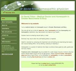
Professional and Inviting
This design is based upon a more linear and structured layout design that is softened by the natural image of water droplets upon a blade of grass. The colour scheme is derived from the natural tones from within the image, which bring the design together as a whole and create a clear and professional set up. The different shades of green from the colour palette are balanced within the features of the site, with softer, lighter tones for the background and a highlighted navigation bar. This professional and grounded approach appeals to both individual clients and businesses alike.
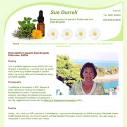
Soft and Subtle
This design creates a calm and inviting appeal by way of a delicate balance of complementing elements. The dynamic curving header works well alongside a gentle background tone and subtle curvy elements within the layout design. The colour scheme is based around a healing pale green colour, often used within homeopathy websites.
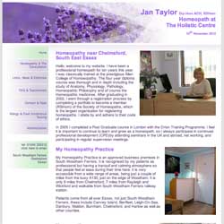
Calming and Personal
This third homeopathy website design example is based upon a delicate header image of lavender flowers, which fades into the title area smoothly. This gives emphasis to the wording within the title by balancing the header area, an important element to achieve if the practitioner has no existing logo design.