
Homeopathy Website Design - Using Colour
Back to Homeopathy Website Design Guide.
This is the Griffen Mill Design Guide to designing websites for homeopaths. This section focusses on the use of colour. Other parts of the guide focus on choosing images, and making appropriate content and copywriting decisions. Click to return to the main guide.
Colour for Homeopaths
As with any website and client, individual client preferences are paramount, especially within the design of websites for homeopaths, however in our experience certain colour choices and palettes are more popular with homeopaths. These tend to be colours associated with calm and warmth along with a sense of energy and well-being, such as purple, yellow or soft greens. Rarely would we create a homeopathy website with bright and vibrant colours such as pink or red, which are better suited to a more beauty orientated website. There is always a balance to be met when designing for homeopaths, as the website aims to be professional and grounded, yet it is also vital to create a warm and inviting appeal, sensitive to the nature of the client's work.
Another factor that will of course influence colour is the image choice, and homeopathy websites are likely to include images of herbs and medicines. It is key therefore to ensure your palette complements this.
Colour Palettes for Homeopaths
There are a number of tools online which are suitable for experimenting with and choosing colour palettes. Here are a few that we have used often for homeopathy websites. Different therapists will have a leaning to different styles of palette, depending on whether they wish to present a more individual and vibrant look or something more low key and businesslike.
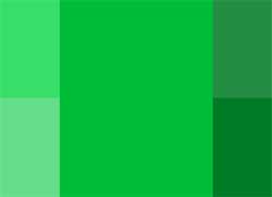
Option 1: Natural and Soothing
This colour palette is based upon a natural green tonal range. The scheme is based on a single colour tint, and uses only variations made by changing the saturation and brightness. A homeopath may wish to use this scheme to maintain a consistent design, in-keeping with their logo or existing business literature. The use of lighter shades as a background tone along with darker headings will balance the design well. A lighter lime green colour can be used as an accent colour, which can complement a monochromatic design well by highlighting certain elements.
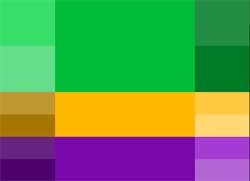
Option 2: Healing Contrast
The aqua greens within this palette are colours associated with healing and emotional security, with green shades used to indicate safety upon medical drugs leaflets and advertisements. The contrasting yellow and purple shades were chosen using an accented analogic model, where the complementing colours are of equal distance from the primary on the colour wheel. The yellow and purple must be used as a complement, since their overuse could cause tension within the design. However, when used as an accent within details, the scheme can be very effective and elegant.
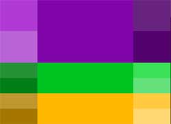
Option 3: Subtle Energy
In this palette the primary colour is supplemented by two colours, placed identically on both sides of its complement. Unlike the sharp contrast, this scheme is slightly softer on the eyes when using the less saturated colour options within the palette. Starting from these basic colour choices, the palette shown gives the option of choosing more muted shades or richer more vibrant choices. The complementary greens can be used for links or subheadings, with the brighter greens used for features such as links. With more muted shades used within headings, a more subtle appeal is created to tone down and ground the overall design.