Acupuncture Website Design - Shape and Aesthetics
Back to Acupuncture Website Design Guide.
This is the Griffen Mill Design Guide to designing websites for acupuncturists. This section focusses on the use of shape and related aesthetic decisions. Other parts of the guide focus on choosing images, colour and making appropriate content and copywriting decisions. Click to return to the main guide.
Aesthetic choices for acupuncturists
In our experience acupuncturists have a preference for website designs that have a flow to them and organic looking smooth lines. This will often work better with images from the curves of the human body or from nature. Occasionally a therapist will prefer a more angular look perhaps it if fits well with a logo or a particular image they like. This might be diagonals or even something more boxy which can be better suited to a more corporate image.
Below we have shown a few examples of designs we have created, with some commentary explaining the design rationale, which you may find useful in seeking inspiration for your own ideas.

Calm, clean and inviting
Every element of this example displays a calm and gentle appeal. By use of soft tones within a gentle curvy layout design, the relaxed pose of the subject within the header image is complemented well. The simple and sophisticated structure to the design is easy to read and creates an inviting appeal to both individuals and corporate clients.
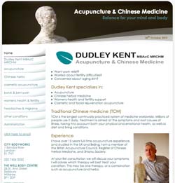
Professional and grounded
This design gives a much more grounded outlook, with reference to the scientific background that this ancient medicine derives. Yet the gentle curves within the layout soften the design and complement the practitioners logo, along with a colour scheme to match.
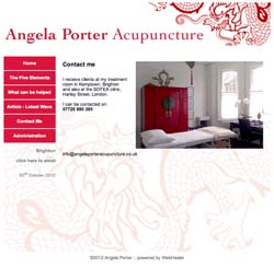
Personal and welcoming
This design uses a much more vibrant colour palette that complements the treatment room. The pattern used within the background shows links to the history of the practice and balances the different elements within the website design. With no distinctive logo design, the brightly coloured header features work well, and do not risk distraction from a company logo.