
Designing Websites for Acupuncturists
This is the Griffen Mill design guide to designing websites for acupuncturists, part of our website design guide series. Over the years, the individual designers within Griffen Mill have created websites for a huge number of acupuncturists, via our key client WebHealer. As one of the therapies that are usually referred to as complementary, an acupuncture website must, in our opinion, convey a professional and health oriented identity, yet avoid coming across as too clinical. The designer must be mindful of the target audience and convey a soft and inviting appeal. This can affect preferred colour choices, and very often warm colours are balanced delicately with cooler ones.
Guide Structure
This guide, like most in this series, has the following key sections.
- Typical design requirements for acupuncture websites
- Choosing colour for acupuncture websites
- Shape and related aesthetic decisions
- Images and photographs for acupuncture websites
This guide continues with section one, and you may use the above links to read more about later sections, which will go into more detail. In each case, the approach used to communicate our ideas leans towards examples, such as examples of images useful for an acupuncture website or palettes that often appeal to acupuncturists.
Typical design requirements for acupuncture websites
Although each acupuncturist will have their individual preferences in terms of style, colour palette and imagery, certain common traits appear often in acupuncture website design. Very often, unless the client is aiming to appeal more for corporate business, the colour palettes used will tend to gentle natural colours, such as turquoise or teal, which are softer, more personal and inviting. When done well this will help evoke a sense of wellbeing and comfort.
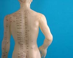
When choosing the colour palette, the designer should be mindful of the images used and the tones used within them, so often there will natural tones to complement images of plants and nature, or reds and maroons to complement images relating to the history of this ancient practice. To help with a harmonious colour scheme, the photographs used can involve a composition that includes the range of colours in the palette. A variety of images can be used, including those that show the scientific background of the practice, e.g. Acupuncture Model.
Finally, shapewise an acupuncture website will tend to have more flow and organic curve than, say a counselling website. The designer should be mindful though that an image of professionalism is important as well as an image of just warmth and the human touch.
On 6 March 2012 Mina Haeri Acupuncture relaunched their website www.minahaeriacupuncture.co.uk after an A La Carte redesign by our designer Megan. The client was looking for a professional design, slightly understated, but with a preference for curves and organic flow. See full press release
On 15 June 2010 Kyoko Durnall Acupuncture relaunched their website www.tcmacupunctureclinic.co.uk after an A La Carte redesign by our designer Amanda. The client was looking for a professional design, slightly understated, but with a preference for curves and organic flow. See full press release