
Complementary Therapy Website Design - Shape and Aesthetics
Back to Complementary Therapy Website Design Guide.
This is the Griffen Mill Design Guide to designing websites for complementary therapists. This section focusses on the use of shape and related aesthetic decisions. Other parts of the guide focus on choosing images, colour and making appropriate content and copywriting decisions. Click to return to the main guide.
Aesthetic choices for complementary therapists
In our experience complementary therapists have a preference for website designs that have a flow to them and organic looking smooth lines. This will often work better with images from nature. Occasionally a therapist will prefer a more angular look perhaps it if fits well with a logo or a particular image they like. This might be diagonals or even something more boxy which can be better suited to a more corporate image.
Below we have shown a few examples of designs we have created, with some commentary explaining the design rationale, which you may find useful in seeking inspiration for your own ideas.
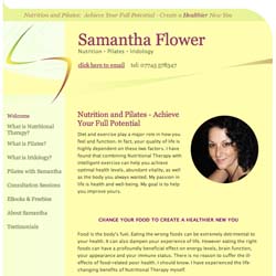
Calm and personal
This design creates a calm and inviting appeal by way of a delicate balance of complementing elements. The dynamic logo design works well alongside a gentle background tone and subtle curvy elements within the layout design. The colour scheme is based around a healing yellow colour, often used within complementary therapy websites.
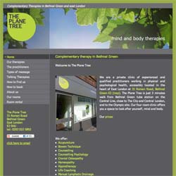
A more corporate look
This design has a more business like feel to it, yet still incorporates a sense of nature and energy, typical to that of complementary therapy websites. The use of straight lines and geometrical features to the websites elements complements the curvy nature of the company logo. Using brighter greens within the highlighted text and links helps to make the important information stand out and break down the page well. This professional and grounded approach appeals to both individual clients and businesses alike.
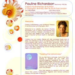
Warm and bright
This third complementary therapy website example uses a more vibrant colour palette in a delicate style, along with some rich flower imagery. Simple curved edges to the content areas separate it from the navigation. As the client does not have a distinctive logo, the heading area is busier as it does not risk distracting so much from a logo.
Dolly Garton has chosen WebHealer's mobile-friendly Social ColourMAX design for her website to promote her Well Being therapy business, offering various complementary therapies. The curved stepping stone path feature image gives a sense of progressing towards that state of wellbeing, while her subtle use of pink for highlighting contrasts nicely with the muted browns in the rest of the website design. The wording that she's used is also well laid out, with good use of pink sub-headings, and features coloured boxes with white text to make certain important messages stand out. The overall effect is to give the website good shape and balance, and this ensures a very easy reading experience. These observations and comments were made on March 11th 2016 – the website may have been updated since then. www.dollygartonwellbeing.co.uk