
Complementary Therapy Website Design - Using Colour
Back to Complementary Therapy Website Design Guide.
This is the Griffen Mill Design Guide to designing websites for complementary therapists. This section focusses on the use of colour. Other parts of the guide focus on choosing images, and making appropriate content and copywriting decisions. Click to return to the main guide.
Colour for Complementary Therapists
As with any website and client, individual client preferences are paramount, especially within the design of websites for complementary therapists since there is a range of therapies included. In our experience certain colour choices and palettes are more popular with complementary therapists. These tend to be colours associated with calm and warmth along with a sense of energy and well-being, such as purple, yellow or soft greens. Rarely would we create a complementary therapists website with cooler colours such blue or grey, which are better suited to a more "medical" website. There is always a balance to be met when designing for complementary therapists, as the website aims to be professional and grounded, yet it is also vital to create a warm and inviting appeal, sensitive to the nature of the client's work.
Another factor that will of course influence colour is the image choice, and complementary therapy websites are likely to include natural images. It is key therefore to ensure your palette complements this.
Colour Palettes for Complementary Therapists
There are a number of tools online which are suitable for experimenting with and choosing colour palettes. Here are a few that we have used often for complementary therapy websites. Different therapists will have a leaning to different styles of palette, depending on whether they wish to present a more individual and vibrant look or something more low key and businesslike.
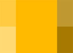
Option 1: Warm and Bright
This scheme is based on a single colour tint, and uses only variations made by changing the saturation and brightness. A complementary therapist may wish to use this scheme to maintain a consistent design, in-keeping with their logo or existing business literature. The use of lighter shades as a background tone along with darker headings will balance the design well. A darker yellow/gold colour can be used as an accent colour, which can complement a monochromatic design well by highlighting certain elements.
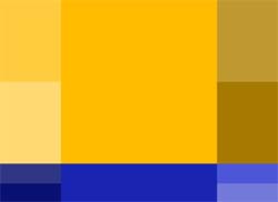
Option 2 : Warm and complementary
This palette is based around a warm golden yellow colour, which is in the range often used in complementary therapy websites, with deep blue as a complementary colour. On the colour wheel, the warm colour has a hue of 55 degrees, although colours slightly cooler than are also fine. Starting from these basic colour choices, the palette shown gives the option of choosing more muted shades of orange or richer more vibrant choices. The complementary blues can be used for links or subheadings, with the brighter blues used for features such as links, rather than for headings which could be shades of more muted darker blues to tone down and ground the overall design.
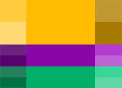
Option 3: Dynamic Contrast
This colour scheme uses an analogic model, which complements the primary colour with its adjacent colours set at either side on the colour wheel. By using a tone only 20 degrees from the primary colour, a natural and dynamic complementing scheme is created. These bright and energetic colours are perfect for a complementary therapy website as they create a warm, healing and inviting appeal, whilst maintaining a professional and grounded outlook. The colours within this scheme also complement many of the tones found in natural images such as flowers and fruit, likely to be used within complementary therapy websites.
Alchemical Healing have chosen a mobile friendly design for their holistic healing website which is important as the majority of people nowadays are searching the internet on a mobile device or tablet. She has picked out the key colour in the feature image of a soft pink and has used this throughout her site to emphasise certain sections of the text without it being over powering. The image of herself also fits in with the feature image picking out the tan of the bamboo and making for an overall complementary look. These observations and comments were made on December 8th, 2015 - the website may have been updated since then. www.alchemicalhealing.co.uk
Complementary therapy websites are typically more visually vibrant than mental health related websites. The latter need to take a more cautious and subdued approach to colour, whereas websites like this homeopathy site can take a more sanguine approach. Richer colours resonate with the principle of energising and strengthening the body's own natural immune system. www.homeopathictreatmentonline.com
Social ColourMAX is the WebHealer design that has been chosen for the website of Kinesiology For Health. The feature image of a path of stones curving through a suggested woodland is a great choice for a therapy site as trees and natural themes convey a positive and calming mood. They have then picked up the brown and green from this image and used this on other areas of the site to create a consistent and professional style throughout their pages. These observations and comments were made on December 10th, 2015 - the website may have been updated since then. www.kinesiology4health.com
The website of the Massage and Wellbeing Centre in Exeter is using an A La Carte design. The Silver Design service has taken over from the A La Carte design service, which does not have mobile friendly functions, but this is still a great design. The slightly abstract image at the top of the page gives a great base for the colour scheme which has picked out a burnt orange and complementary purple which is used throughout the website giving a well-balanced and consistent feel. They have gone on to add some quote boxes and have emphasised the text by changing its colour. It is good to be cautious when doing this however as you can introduce too many colours making the site appear dis organised and un tidy. These observations and comments were made on September 12th 2016 – the website may have been updated since then. www.massageandwellbeing.co.uk
Social ColourMAX is the mobile friendly design of choice of Mo Singh for her massage, reiki and theta healing website. The feature image of subtle pink flowers instils a calming sense of nature and new beginnings which is perfect for her line of work. She has then followed good practice in matching the colours from this feature image to the visual language throughout her website. This helps to create a sense of balance that is naturally pleasing to the eye of the viewer (or potential client). Mo has then added further images to the website, which fit in with this colour scheme helping to add to the sense of symmetry. These observations and comments were made on December 10th, 2015 - the website may have been updated since then. www.mosinghhealing.com