Counselling Website Design - Using Colour
Back to Counselling Website Design Guide.
This is the Griffen Mill Design Guide to designing websites for counsellors. This section focusses on the use of colour. Other parts of the guide focus on choosing images, and making appropriate content and copywriting decisions. Click to return to the main guide.
Colour for Counsellors
As with any website and client, individual client preferences are paramount, however in our experience certain colour choices and palettes are more popular with counsellors. These tend to be colours associated with a calm, inviting and neutral outlook, such as blue and turquoise. Rarely would we create a Counselling website with vibrant colours such as pink and red, which may not create the right feel to its visitors. Counselling websites are better suited to a more "medical" feel. Although, there is always a balance to be met when designing for counsellors, as the website aims to be professional and grounded, yet it is also vital to create a warm and inviting appeal, sensitive to the nature of the client's work.
Another factor that will of course influence colour is the image choice, and counselling websites are likely to include images that convey a sense of journey, an open landscape or natural scenery. It is key therefore to ensure your palette complements this.
Colour Palettes for Counsellors
There are a number of tools online which are suitable for experimenting with and choosing colour palettes. Here are a few that we have used often for counselling websites. Different therapists will have a leaning to different styles of palette, depending on whether they wish to present a more individual and vibrant look or something more low key and businesslike.
Option 1: Smart Monochromatic
This scheme is based on a single colour tint, and uses only variations made by changing the saturation and brightness. A counsellor may wish to use this scheme to maintain a consistent design, in-keeping with their logo or existing business literature. The use of lighter shades as a background tone along with darker headings will balance the design well. A more saturated blue used as an accent colour can complement a monochromatic design by highlighting certain elements well.

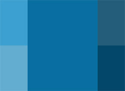
Option 2: Cool Contrast
This palette is based upon the calm and cool blue shades of the monochromatic scheme, which is a range used often for counselling websites. This gentle and professional tone is complemented well by use of a contrast colour. In this case a warm shade from the opposite side of the colour wheel will balance the design. These warm shades can be used carefully as an accent colour within the website, for use in subheadings or links. It is important to ensure the contrast shades are used delicately so as not to overpower the design.
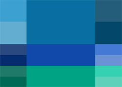
Option 3: Cool Complement
This colour scheme uses an analogic model, which complements the primary colour with its adjacent colours set at either side on the colour wheel. By using a tone only 20 degrees from the primary colour, a natural and elegant cool complementing scheme is created. These calm and gentle colours are perfect for a counselling website as they create a safe and inviting appeal, whilst maintaining a professional and grounded outlook.
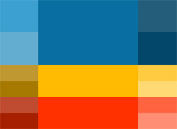
Option 4: Bright & Stylish
This colour palette includes warmer and brighter tones to contrast the cool blue scheme. These brighter tones will add energy to a counsellors website design when used to highlight and complement the primary colour, resulting in an uplifting and balanced overall look.
Example Counselling Designs
Here are some examples of counselling websites. Some have been created as bespoke designs by members of the Griffen Mill team, whilst others are built on a generic design which we created.
BTC Counselling in Kennington and Streatham is using one of our newest standard designs the Curvy ColourMAX design. They are using our suggested logo image and colour scheme, but have added a touch of personalisation by adding some different coloured text in the editable are of the site. You can see their website here www.btccounselling.co.uk
Clearview counselling and coaching service chose a self customising approach to their latest mobile friendly website design. The colour scheme they chose conveys warmth and energy which is a little unusual for counselling or psychotherapy websites which normally employ cool blues or greens evoking space and nature. Counselling websites do vary however and Clearview's focus on life coaching and personal growth makes this more energetic colour scheme very suitable especially combined with the thoughtful and optimistic image of a woman looking out to sea. Observations and comments made on October 17, 2015 - the website may have been updated since then. www.clearview-counselling.co.uk
For her Counselling Clinic website, Psychotherapist Anthea Hollingworth is using our flexible standard design, Curvy ColourMAX. She has chosen to use our suggested image of a water droplet and colour scheme to match, although this design does have a number of options to personalise it. You can see her counselling website here www.counsellingclinic.co.uk
Shanta Batacharia is a Counsellor in South East London. For her Counselling website she has chosen to use one of our standard design templates, the Chequers ColourMAX design, and, while this design can be personalised, Shanta has decided to stick with our suggested logo image and colour scheme, which does all blend together well to give a sense of peace and calm. You can see her website at www.counsellingforinsight.co.uk
Lesley Millane has opted for one of WebHealers slightly older designs for her counselling website. She has kept the design clean and uncomplicated and which makes it very user friendly. The warm brown tone she has used for the background marries perfectly with the simple tree feature image of the design and this help to convey a sense of friendliness and approachability and also of comfort and security which ideal for those seeking the services of a counsellor. These observations and comments were made on November 6th 2015 – the website may have been updated since then. www.counsellingforlondon.co.uk
Dr Alison Stuart is a Psychologist in Chelsea and Fulham. For her psychology website she has chosen to use our Standard ColourMAX design which is very versatile and has a number of options for customisation. She has decided not to use a logo, and has selected a calm colour scheme with a warm neutral tone. You can see her design here www.dralisonstuart.com
Marina Broadley's counselling website uses an attractive modern design with a 'responsive' mobile optimised design that adapts to fit large or small screens. Her colour scheme achieves a look that is both bright and dynamic, but also very tranquil, through the clever combination of a cool pale blue with a warm shade of byzantine pink. These colours are picked up in her feature image which depicts a young girl meditating whilst looking out at a glorious blue and pink sky. Blue and pink formatting is also used throughout the website, to good effect. Standard sub-headings are presented in a calm blue that is used as the soothing 'narrative voice' of the website, whilst inspirational prompts such as “Counselling changes lives...from the inside out” and “You can have a happier, more peaceful mind and heart” are presented in the more energetic pink. These observations were made on June 23rd, 2016 – the website may have been updated since then. www.hinckleycounselling.co.uk
For her counselling and therapeutic writing website, Jacqui Empson-High has opted for a recent mobile friendly design of WebHealer. She has chosen a down to earth colour scheme of dark brown for it, which fits perfectly with the feature image of some stepping stones leading you through a wood. The colour scheme gives a sense of security and comfort and Jacqui has continued with the natural visual theme by adding further images of natural settings, all conveying a sense of calm, peace and tranquillity. These observations and comments were made on October 30th 2015 – the website may have been updated since then. www.jehcounselling.co.uk
Judi Keshet-Orr is a Psychotherapist in Golders Green, North London. She is using an A la Carte design for her website and she instructed the Griffin Mill designer that she wanted a professional look to her website, she liked green and natural colours. The designer found a lovely wooded image for the header and has used neutral tones throughout the website to give it a calm and flowing feel. www.jkopsychotherapy.co.uk
Julie Cheetham is a counsellor in East Horsley and Guildford. She has chosen to use our standard design Curvy ColourMAX which is one of our newest designs and has various options for customisation. Julie has inserted her own logo, and has altered the colour scheme to contrast with her logo. You can see it at www.juliecheethamcounselling.com
Patricia McEntee is a psychotherapist and counsellor based in Clapham and Victoria, South West London. She has opted for a bespoke design for her website, and WebHealer's designer has taken her own star and crescent feature image, together with her portrait, and created a balanced design based around these 2 strong images, featuring shades of cyan blue in keeping with her company branding. As a London-based therapist, she's also chosen to use a variety of contemporary city-based images, which should resonate well with her potential clients. These nicely break up the website text, which is also well-separated into easy to read paragraphs, and are joined in the website content by coloured text testimonials in stand-out boxes, which nicely round off the different website pages, further encouraging contact. Observations made on April 8th, 2016 – the website may have been updated since then. www.lifeconcerns.net
Neil Marsh is a Play Therapist based in Leighton Buzzard. For his therapy website he is using our standard design called “Sketch” which does not have many options for customisation, but which he felt fitted his business theme. You can see his website here www.neilmarshplaytherapist.co.uk
Nicholas Bayley is a psychotherapist and counsellor in Reading. For his psychotherapy website he is using one of our flexible designs, Standard ColourMAX and he has customised it to give it a personal feel. He has taken off the logo and has introduced his own colour scheme to tie in with his general business theme. You can see his website here www.nicbayleypsychotherapy.co.uk
Sally Williams is a life coach and counsellor in Devon, Dorset and Somerset. For her coaching and counselling website she asked her Griffin Mill designer for a unique bespoke design, and they have used her logo as the base for a calm and tranquil colour scheme with a simple design that gives a professional feel. You can see her website at www.ontracktherapy.co.uk
Pauline Brumwell offers Counselling and Hypnotherapy in Harrogate, north Yorkshire and she is using an A La Carte design. Her Griffin Mill designer was asked for a professional looking website with a calm feel, and they have found the perfect sunset image for this. They have then pulled out the blue tones from the image and blended them through the website to give it a sense of fluidity. You can see their design at www.pbcounsellingplus.co.uk
Alistair Mackinnon has chosen one of WebHealer’s standard designs for his Populi Therapy counselling website and has customised the colour scheme himself. Counselling websites often use blue or green colour schemes which give a calm and reassuring feel and Alistair has built on this by using a slightly stronger teal base with a hint of gold. This helps to signify peace and balance with a trace of achievement which is perfect for this type of therapy website. It also complements the natural feature image that he has chosen to use. Observations and comments made on October 17, 2015 - the website may have been updated since then. www.populitherapy.co.uk
For her counselling website, Ruth Buckland has chosen one of WebHealer’s standard designs which she has gone on to customise herself. She has a picked a fresh, clean colour scheme and has chosen an image of a sunset over a calm sea. Water is quite a popular choice for images for counsellors and it is said to represent the emotional state of mind and the transition to conscious awareness. Overall her website has a pleasing feel and her consistent and organised layout of the content adds to the positive experience of the visit. These observations were made on 21st October 2015 and the website may have been updated since. www.ruthbucklandcounselling.co.uk
Sonya Landesmann is a Psychotherapist and Counsellor in Crouch End and the City of London. She is using a standard design for her website, the Curvy ColourMAX design, which has a number of ways in which it can be customised. She has decided to use our suggested logo image of a water drop, but has changed the colour scheme to a richer deeper colour to complement it. You can see her website at www.slpsychotherapyandcounselling.co.uk
Solace Counselling Services have chosen to use a slightly older design of WebHealer’s but it still a great example of a crisp and clean design. Jeanette has customised the colour scheme herself in keeping with the blue of the feature water droplet image. Blue is a great colour scheme for a counsellor as it is said to convey a sense of trust and integrity and is a very popular choice. The other images Jeanette has added to the content area of her pages fit in with this colour choice giving a calm and consistent feel to the website overall. These observations and comments were made on December 3rd, 2015 - the website may have been updated since then. www.solacecounsellingservices.co.uk
Seashore is the design choice of Tom Cowan for his Counselling website. This is one of WebHealer’s slightly older designs but is a lovely one incorporating the sea. It uses a traditional blue colour scheme which is a great choice for the website of a counsellor as it conveys trust, peace and loyalty. Tom has built on this nautical design theme by adding some images of the sea with himself and also of mountains in the background which adds an element of nature and a sense of calm that this brings with it. These observations and comments were made on October 28th 2015 – the website may have been updated since then. www.tomcowancounselling.co.uk
Woman to Woman psychotherapy in Wimpole Street in Central London, is using one of our versatile designs called Chequers ColourMAX. This design can be customised to include a unique logo image, such as the one they have used on their site. They have also altered the colour scheme to further personalise it. You can see their design here www.womenstherapy.co.uk
Roz Turner-Drage is a counsellor near Purley and South Croydon. For her counselling website she is using the Curvy ColourMAX design template, which has a number of customisation options and she has personalised it with her own logo, and has nicely selected a colour scheme that ties in really well with her logo image. You can see what she has done with her website at www.woodcotecounselling.co.uk