
Hypnotherapy Website Design - Shape and Aesthetics
Back to Hypnotherapy Website Design Guide.
This is the Griffen Mill Design Guide to designing websites for hypnotherapists. This section focusses on the use of shape and related aesthetic decisions. Other parts of the guide focus on choosing images, colour and making appropriate content and copywriting decisions. Click to return to the main guide.
Aesthetic choices for hypnotherapists
In our experience hypnotherapists have a preference for website designs that have a balance between an organic flow to them with smooth lines and a more linear, structured outlook. Images from nature are often used, which complement these aesthetic elements. Occasionally a practitioner will prefer an angular look perhaps it if fits well with a logo or a particular image they like. This might be diagonals or even something more boxy which can be better suited to a more corporate image.
Below we have shown a few examples of designs we have created, with some commentary explaining the design rationale, which you may find useful in seeking inspiration for your own ideas.
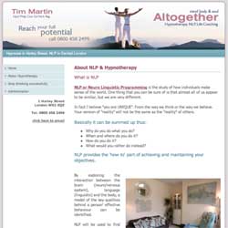
Soft and subtle
This design creates a calm and inviting appeal by way of a delicate balance of complementing elements. The header image fades smoothly into the title, where the colours from the image are brought into the content text and headings to bring the design together. This fundamentally geometric layout is softened by the header image fading into a professional white background, along with a gentle turquoise tone for the navigation menu, a colour often used within homeopathy websites.
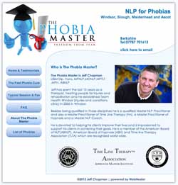
Personal and energetic
This next example has a more organic flow to it, echoing the curvy shape of the client's dynamic logo. It has been kept simple though, so that the shape of the website design does not dominate and distract from the distinctive logo, whilst ensuring that it has space. The bright blue colours found within the logo are used to highlight the website title.
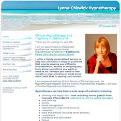
Calm and professional
This third example of a hypnotherapy website is based upon a relaxing seashore image that flows across the header. A gentle curve fades into the content area along with a colour scheme that highlights the blue and turquoise tones found within the image, an important element to achieve if the practitioner has no existing logo design.